
The mobile age is here and more people are turning to their cell-phones for their shopping needs. Almost 230 million people purchase items online with that number only expected to increase each year. To meet customers’ needs and make their viewing experience easier, having a mobile app or mobile version of your eCommerce store will give customers a better, smoother overall experience and can help drive sales on your webstore. But while mobile native apps and PWAs can be costly, there are actions you can take today on your existing eCommerce store that will make it more mobile accessible to your customers and profitable for your business. Keep scrolling to learn the best practices to make your apparel and accessories eCommerce store mobile-friendly.
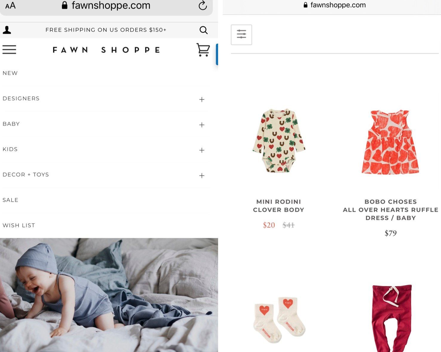
Include Simple Navigation
If you want users to enjoy visiting your site on their mobile device, you need to have an easy to use and simple navigation. Navigation directs your customers to where they want to go or to find what they are looking for. Due to limited screen space on phones, your content must not look overcrowded on a mobile device. An overcrowded navigation can cause disconnect, confusion, frustration and lead to the user exiting the site. Navigation menus on both mobile devices and desktops have the option of having dropdown lists. Multiple dropdown menus may structurally fit on a desktop but will take up the majority of space on a phone. Avoid this issue by keeping your mobile navigation to a few dropdown lists and all in a single column or row.
Fawn Shoppe has an excellent example of simple, clean and mobile-friendly navigation on their homepage and landing pages:
Limited-time sales and discount codes
Why do you think your inbox is constantly flooded with limited-time sales and discount codes? Because they work! These time-sensitive initiatives are a no-brainer for creating a sense of urgency in your customers, and almost seem to create a ticking clock in their minds. If someone is interested in your product or service and sees an end date or expiration date for a discount code, it’s a trigger that compels them to make up their mind on whether or not to purchase. A deadline is a powerful incentive to action. Help your customers make up their minds by giving them a time limit.
Create Easy Registration
For every store, easy registration is a must. It is where your brand gains customer information to send future emails, newsletters, messages and fulfill orders. Most people do not want to spend longer than a couple of minutes inputting their information just to browse a store. Plus, a small screen with a complicated registration may deter people from continuing to purchase. Instead, stick with the option of an easy registration at checkout that involves limiting your required fields to an email or phone number. You can ask for additional information like shipping or billing addresses and payment information later when the customer is at the end of their checkout process. Another option would be to allow users to register using their Facebook or Google account. Even on mobile, this is a simple 1-click option that will collect all the necessary data fields without requiring customers to enter the fields one by one.
Position CTAs Properly
Trying to click on specific buttons and tabs can be hard enough on a mobile device, so placing call-to-action (CTA) buttons incorrectly can make the user experience nearly impossible. In most cases, the user will leave the page and most likely never return if they can’t find the navigation and purchasing links they’re looking for. You can avoid this from happening by strategically and correctly placing your CTAs and making them easy to find. And it’s especially important to make sure to place key CTAs like Add to Cart and Checkout front and center.
Accept Guest Checkout
When people use their phones to make any purchases, they are expecting a fast checkout process. And in many instances, customers prefer to skip registering during checkout or altogether. Phones have made information fast and accessible, so the checkout process on a mobile device needs to be the same way. The best way to achieve a fast checkout on mobile (and desktop as well) is to accept guest checkout. This option allows your business to sell to a more diverse audience because it encourages one-time customers to purchase as well. While setting up your checkout page, make sure to include a CTA that states checkout as a registered user or guest checkout. This may limit some registration fields; however, it gives your brand a wider possibility of new customers.
Write Short & Catchy Content
With the limited physical viewing space on a mobile device, it is important to keep your content short and catchy. Lengthy product descriptions, long blog posts, or too many images cluttering product pages divert many mobile device customers. Make the shopping experience easier by using short, catchy, and essential content on product pages. To help keep your content short and memorable, we recommend working with a marketing firm that knows how to create concise yet impactful content, including photos, graphics, video or written copy.
Size Images Correctly
Mobile screens and computer screens are two very different layouts. An image that loads and fits for a desktop website could take up the entire screen on its mobile counterpart, take too long to load or create pixilated or low-quality images. To avoid these scenarios, you need to correctly size your mobile images or partner with a marketing firm that knows how to format images for desktops and mobile devices. Even though there are no set sizing requirements, it is best to keep mobile images as small as possible to balance image quality against mobile networks download speeds and file size against mobile data caps. Generally, images range from 240 x 320 to 2560 x 1440 in size.
Always Upsell
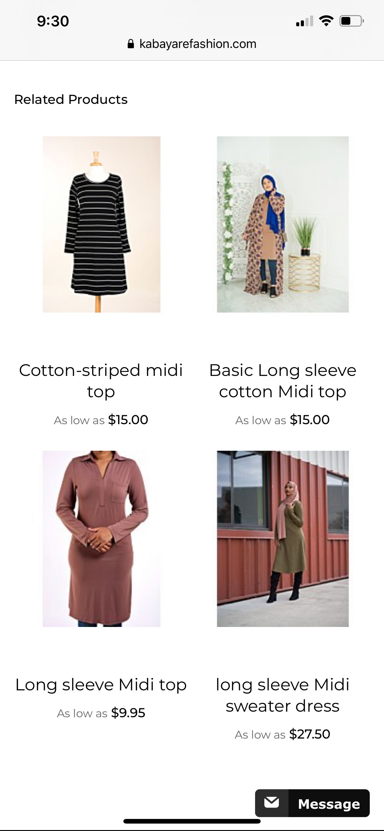
Just because there is a lack of space on a mobile device does not mean you can overlook the opportunity to upsell your products. Upselling on product pages and shopping carts introduce customers to new purchasing opportunities. Think of it as the impulse items that many brick-and-mortar stores use to entice customers at checkout. After the product information, show off more of your webstore’s inventory by including links to items that other customers who bought this also viewed this or people also viewed. Studies show that 61% of customers say they are more likely to buy when companies include upselling that matches their preference. Many stores recommend other products that complete an outfit or are similar. An apparel eCommerce store that partners with InteractOne, Kabaryare Fashion has a simple way of upselling similar content with an analogous style and price when customers view their products.
Conclusion
Shopping through mobile devices will become more popular as technology continues to advance. Have a step up from other competitors by following these best practices to make your apparel and accessories eCommerce store optimize mobile shopping. Contact us today for more information on how InteractOne can help your webstore become mobile-friendly.