A Primer for a Successful Digital Marketing Campaign

A Primer for a Successful Digital Marketing Campaign

Whether you are a brick-and-mortar retail store or an eCommerce store — or have both, it is crucial to implement some form of a digital marketing campaign. As you know, a digital marketing campaign is an online marketing effort that companies use to increase engagement, conversions, traffic and revenue through one or more digital channels. Digital marketing campaigns usually tie in with the brand’s overarching goals and are extensions of and complementary to other more traditional marketing efforts. Given that eCommerce webstores indeed live on the internet, it is even more important to launch and optimize a successful digital marketing campaign to not only increase sales but to reach a larger, wider and more diverse audience. In this guide, we’ll provide several recommendations for you to get started with or add to a successful digital marketing campaign to increase sales for your apparel eCommerce store.

Engage in Email Marketing

Direct mail advertising decreases more and more every year with companies opting for the less expensive and fastest advertising route — email marketing. Email marketing is where your company sends emails of sales, information, and products to existing and potential customers. As an online brand, you are most likely to stick to digital advertising, so email marketing is one of the most effective ways to increase sales. By sending emails, you can efficiently inform your customers and prospects about your promotions, products, social media pages and any other relevant information. 

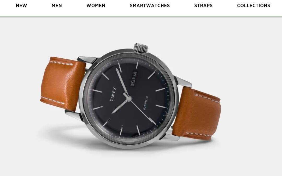
However, you want to be careful not to send too many emails. About 69% of users unsubscribe to companies that send what are considered to be too many emails. So how many emails are too many? Most companies send about two to eight emails a month. That’s a wide range — you’ll need to find out what works best for your business. But, as an apparel eCommerce store, you will most likely want to send about one or two emails a week to show customers a wide variety of products and promotions. Email marketing can be a long and tedious process. That’s why we recommend working with a marketing firm that understands the ins and outs of creating, sending and measuring the results of an ongoing email campaign. Finish Line is a great example of this. They have some great, bold, email designs. 

Post on Social Media

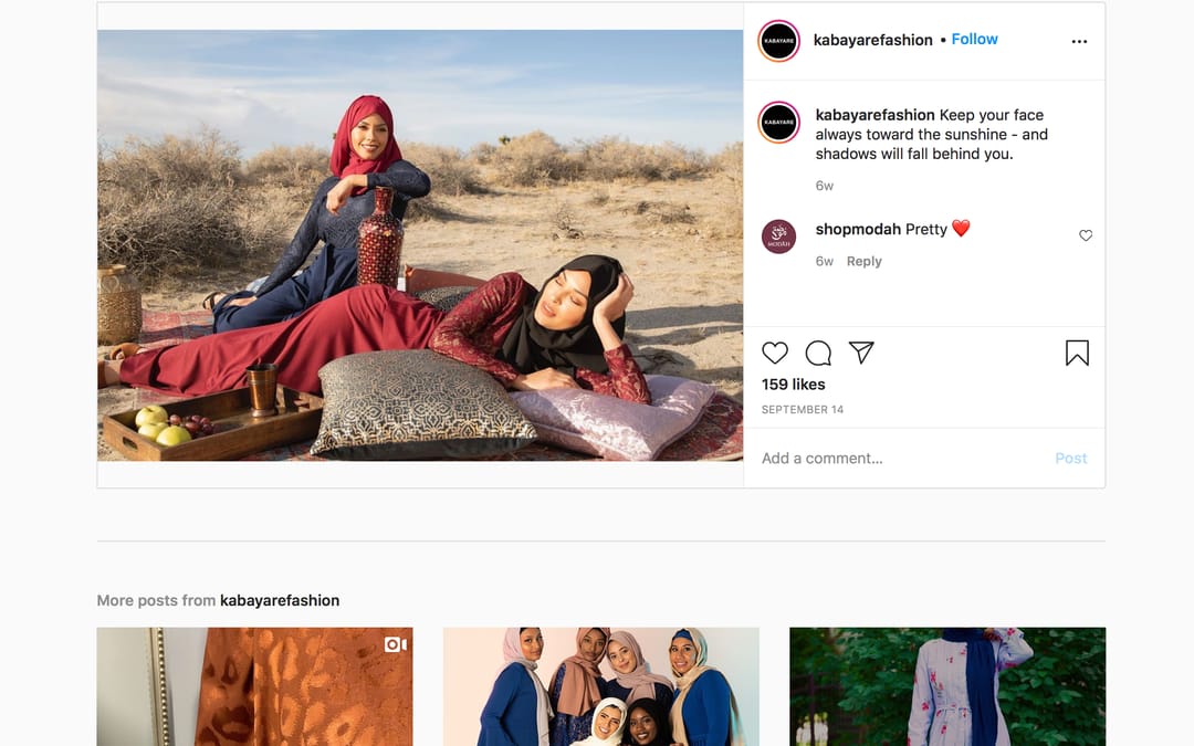
No need to limit your brand to just email marketing, you can also expand to social media marketing. On social media, you can promote current sales and products for customers to purchase. While utilizing social media, you are opening your brand to a potentially wider and more diverse audience. A few social media platforms to post your business on includes Facebook, Instagram, and Pinterest. Posting on social media is not for every company, but we have a few social media tactics you can keep in mind if you do consider the notion of promoting on social media. To avoid the confusion of social media requirements and to make sure that you are posting the most appropriate type of content to each platform, we recommend partnering with an experienced marketing firm that is knowledgeable in social media rules and requirements.

Promote Sales & Deals

For most businesses to have a successful digital marketing campaign, there needs to be some type of promotion to tout; whether it is a sale, deal or event. Having one or more sales during your campaign can help gain customer traction and revenue. You can promote these sales or deals in emails, on your site’s homepage and on social media. These sales do not have to be huge, complicated or even happen every week. Many brands focus on a percentage off of a full purchase sale, a buy one get one (BOGO) event or a clearance event. Including sales and deals as components of your digital marketing campaign not only helps increase revenue but also helps you to understand and improve your webstore conversion rates. ACAIS does a great job of this:

Create Compelling & Memorable Content

In the digital marketing world, messaging is the main communication between the brand and potential customers. Since users only take a few seconds to lose interest and exit a website, it is critical to capture the user’s attention with compelling, memorable and efficient messaging. At first glance, you need to entice customers to stay on the page and continue shopping. This means you need to use messaging including pictures, videos and graphics that evoke emotion, creates a connection with your audience or encourages users to browse through the webstore. There are many ways to show a compelling story through incentives like free shipping, an additional percentage off purchase or short, memorable copy. And if that is not enough of a reason to focus on creating terrific content, here’s one more: Google and the other search engines reward sites with strong, meaningful, compelling content with higher search engine rankings.

Have a Cohesive Story

An aspect of digital marketing that many companies have a hard time achieving is keeping a cohesive story. You want all your creative and graphic assets including emails, verbal and photographic content, social media and ads to structurally and creatively coincide with each other. Whether it is your brand’s overall aesthetic or the specific campaign for the month, this effort to focus will help customers distinguish your brand from others. Creating assets that do not match your brand and the specific campaign can confuse users and cause you to lose potential sales. During your planning meetings, create the story or goal that you want your brand to achieve. For example, if it is a summer event include products, design, graphics and content whether it is video or written copy that customers can associate with summer while staying true to your brand guidelines.

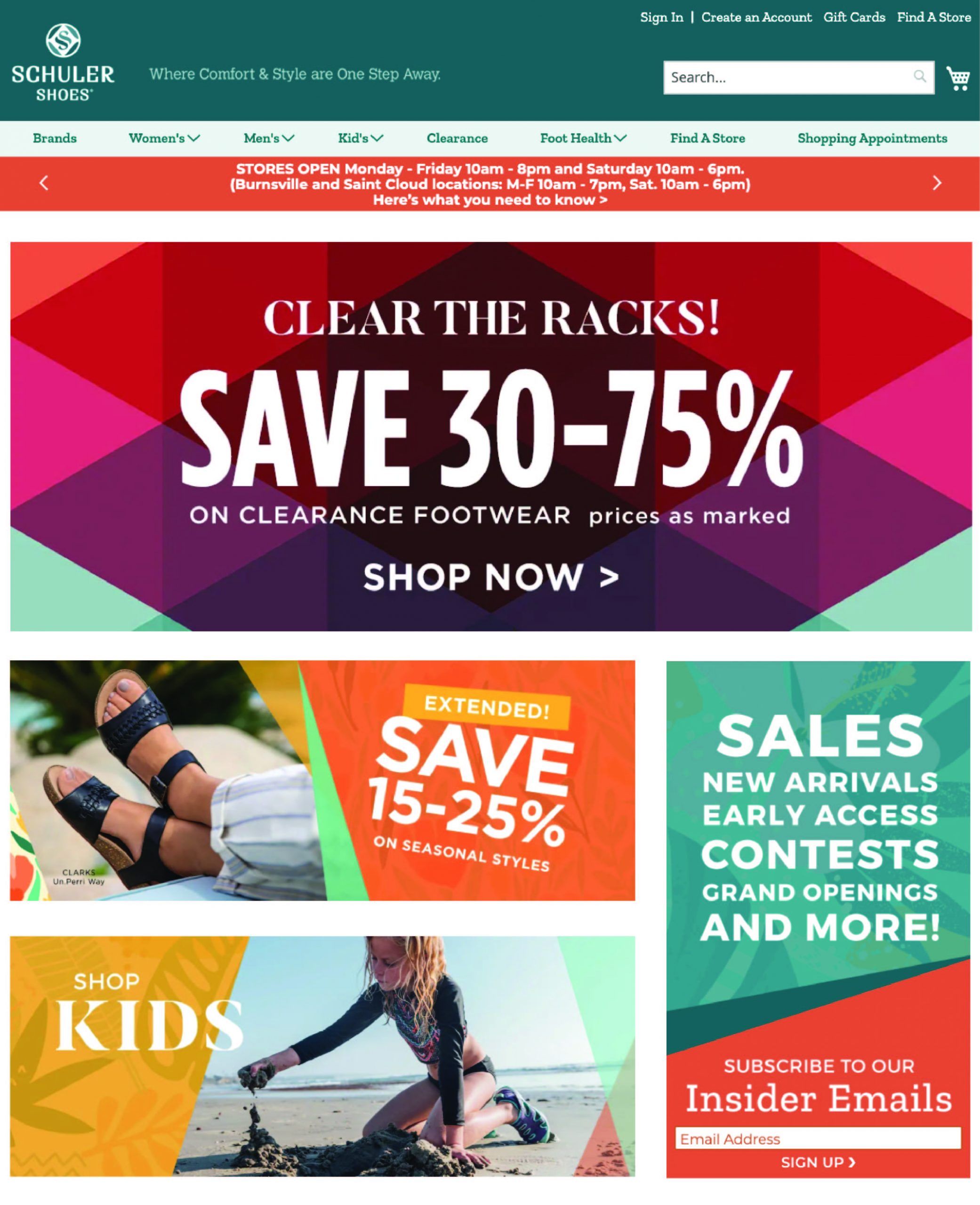
Schuler Shoes provides an excellent example of keeping a cohesive story during their seasonal summer sale. All digital assets including graphic elements, written copy and images focus on giving the offering a summer feel:

Conclusion

As consumers transition more into online shopping, planning and implementing a digital marketing campaign is the best way to increase sales for your apparel eCommerce store. These are just a few tips on how to start and add to a successful digital marketing campaign. For more information on how InteractOne can help your brand create a successful digital marketing campaign, contact us today.

    Get expert help today!

    An InteractOne Senior Team Member will get back to you within a day.

    Drop Us a Line At:

    Our Contact Form

    Or, if you prefer an old-fashioned phone call:
    Phone (USA): (513) 469-3362

    4665 Cornell Rd. Suite 255
    Cincinnati, OH 45241

    Smart Email Strategies to Increase Vitamin & Supplements Sales

    Smart Email Strategies to Increase Vitamin & Supplements Sales

    When it comes to selling supplements, vitamins and nutraceuticals, email is king. In fact, when surveyed, most doctors across the country say that they prefer this type of communication over all other potential marketing channels. So why is email so popular in the supplements world, and how can you be sure that your emails are effective? Keep reading to learn all of this and more.

    What’s the benefit of email for healthcare professionals?

    You might be wondering why so many doctors prefer email over many other routes of communication. It all comes down to time. The benefit of email for healthcare professionals is that it can be done on their own time. Doctors are extraordinarily busy people, and making time to hear from a sales rep, download apps, or fetch their snail mail is unlikely to happen very often. However, emails can be opened quickly and easily when it’s convenient for them.

    What’s the benefit of email for pharma marketers?

    Sending a sales rep or snail mail can be sufficient in some cases, but these modes of communication make it hard to measure results and ROI. With email, however, getting results and measuring ROI is pretty simple and very effective.

    When supplements eCommerce retailers have a good CRM program in place and use it to send an email, they instantly know who opened the email (or didn’t open it), when they opened it and what actions they took from it. Open rates, click-through rates, and bounce rates are readily available, which makes subsequent marketing efforts even easier. After a few emails, supplements marketers can reliably see what information is most important for the recipients and then create more effective emails going forward.

    An additional benefit of email is that the vast majority of your recipients will actually receive your message. Emails have a delivery rate of 90% or more, whereas even viral posts on social media typically only reach about 5% of your social audience.

    Top email marketing strategies

    A lot of research has been done about what’s best to do (and not do) with emails in order to increase pharma sales. Here are a few key takeaways.

    Make the emails mobile friendly. A whopping 80% of healthcare professionals say that they mostly read emails on their phones, not their computers. As a result, emails need to be adapted to various devices and screens in a mobile-friendly format.

    Make the emails personalized and targeted. Doing this creates a better experience for each recipient. After you discover which person clicks on which content, you can use that information to personalize subsequent email communications. Your recipients will feel heard and thus become more engaged with your company.

    Include tips and offers they don’t get elsewhere. Having unique tips in your emails is powerful for your audience. The most successful things to include in pharma emails include tips for remembering to take your medicine on time, as well as exclusive offers they can use when they order in your online store.

    Do subject line testing. Subject line testing has been shown to exponentially increase your open rates and customer loyalty. This may sound simple, but it’s vital! If your recipients don’t like or understand the subject line of your email, they won’t open it… and that ends the line of communication. Subject line testing is crucial, but studies show that most email campaigns don’t take advantage of A/B subject line testing. Missing out on this means missing out on a lot of potential engagement. In addition, it’s often a good idea to include a teaser for the tips that are included in the email in the subject line.

    Consider the frequency and timing of your emails. In general, it’s best to begin sending emails every other week and then increase it to once a week. Then, you can send them more frequently once someone is opening your emails and engaging with them. However, in terms of timing, things aren’t so cut and dry. Test the timing of your emails to see when your audience engages the most. Just like it’s important to A/B test subject lines, it’s also important to A/B test the best times to send emails. You’ll learn a lot from this and then be able to increase your open rates as a result.

    Tips for supplements-specific emails

    There are best practices for emails, and then there are best practices for supplement emails. The supplement space carries many unique limitations that must be considered when creating and sending emails.

    To start, a supplements email must be completely optimized before the medical and legal approval process can begin. Ignoring this rule limits your ability to make changes that can improve open rates, click-through rates, and ROI. In addition, making sure that your emails are optimized before submitting them to the medical and legal team has been shown to get the project done much faster.

    Another example of a supplements-specific email tip is to fill the email with pertinent, relevant, supplements-related information. The more specific the information, the more useful it is for the recipient—and the greater the chance that the recipient will engage with your brand. For example, if your company knows when each recipient should refill their prescriptions, you can send a timely email when it’s time to do so. Your recipients will appreciate your attention to detail and dedication to their unique needs.

    Conclusion

    With email on the rise, creating effective emails has never been more important. And with healthcare professionals relying more and more on email for most of their communications, it’s vital that pharma retailers optimize emails as much as possible. Employing certain strategies can pay off in a big way when it comes to customer loyalty and engagement.

    To find out how InteractOne can help with email marketing for your supplements eCommerce website, contact us today.

      Get expert help today!

      An InteractOne Senior Team Member will get back to you within a day.

      Drop Us a Line At:

      Our Contact Form

      Or, if you prefer an old-fashioned phone call:
      Phone (USA): (513) 469-3362

      4665 Cornell Rd. Suite 255
      Cincinnati, OH 45241

      How to Ensure your Web Store is ADA Compliant

      How to Ensure your Web Store is ADA Compliant

      How accessible is my website? That’s a question everyone should be asking, but unfortunately not everyone does. Despite it being more than 30 years since the Americans With Disabilities Act (ADA) was signed into law, website accessibility isn’t as universally common as it should be. 

      A recent study of the top million websites found that 98.1% of home pages failed to comply with the leading set of Web Content Accessibility Guidelines (WCAG). This is bad not only from an ethical perspective, but from a legal standpoint, too. Websites that don’t meet web accessibility guidelines are at risk of receiving an ADA penalty, and lawsuits are up almost 25% year on year. It’s also bad from a business perspective, as these websites are also most likely losing business to the one in four—or 61 million—adults in the US living with a disability. 

      So how do you make sure your website and/or mobile app is accessible to people with disabilities? First, you need to know about ADA compliance and eCommerce.

      Understanding the ADA

      The ADA consists of five main titles, but Title III (Public Accommodations) is the main one that concerns eCommerce. It requires businesses that serve the public make “reasonable modifications” to their usual way of doing things in order to accommodate persons with disabilities. It also requires that they take steps necessary to communicate effectively with customers with vision, hearing and speech disabilities.

      There has been some confusion among merchants because the ADA doesn’t specifically mention eCommerce businesses—probably because it was signed into law before eCommerce was really widespread. There are those who continue to debate whether the ADA applies to only companies that have brick and mortar stores as well as eCommerce websites, and not to eCommerce-only companies. But most courts agree that websites are accountable under Title III. 

      Currently, the WCAG 2.0 guidelines are generally considered to be the standard, and the Accessibility Guidelines Working Group expect to publish the First Public Working Draft of WCAG 3.0 in January 2021, with the final version slated for after 2022. 

      In the meantime, here are some things you can do to ensure your website adheres to the current guidelines.

      How to make your eCommerce website ADA-compliant

      • Support the latest browsers
        Visually impaired individuals are able to navigate websites through the use of a screen reader, which is software that reads the text and converts it to audio. However, websites must use code that is understood by screen readers. Most issues with screen readers occur because of browser compatibility issues, so making sure your site supports the latest browser versions is a good first step. 
      • Ensure menus are navigable
        Menus on your website should be compatible with screen readers by using the tab key to go to the next element and shift+tab to go to the previous element. Menu buttons should be accessible using the left and right arrow keys, and drop-down menus should be accessible using the up and down arrows. 
      • Add alternative text to images
        Alternative text must be embedded behind images and it must clearly describe the image. Proper headers must also be used. Otherwise, the screen reader will interpret it as “blank” or simply “image.” 
      • Add sign language to your key videos
        Many deaf people who have been hearing impaired since birth cannot read written words, they “read” only sign language. Sign language can help make your videos more accessible for those people. 
      • Include open or closed captions in your videos
        Regardless of whether or not you add sign language videos, you really should include captions or subtitles in videos on your site. This not only ensures your video content is accessible to everyone, it can also boost your views, since many people like to watch videos with the sound off. 
      • Use high-contrast colors
        Low-contrast colors make it hard for visually impaired people to identify critical buttons or even differentiate between the foreground and the background. 
      • Name your links with anchor text
        Using links that describe the page you’re linking to, as opposed to “click here”, not only improves your SEO, it also makes your website more accessible to people using a screen reader. 
      • Make links visible and accessible
        Put your links in a contrasting color so that they’re visible, and ensure your pages are designed so that people can easily navigate to them using the arrow and tab keys on their keyboard. It should also be clear if links open in a new window. 
      • Don’t use any design techniques that can cause seizures
        Make sure your website doesn’t use any content that flashes more than three times per second, as this is likely to cause seizures in people with epilepsy. 
      • Have clear written content
        Use clear fonts with adequate spacing between letters. Organize your written content using descriptive headings, and use concise product descriptions. Also ensure the language you use can be programmatically determined. 
      • Use practical form design
        Side-by-side information can be difficult for screen readers to parse, so opt for stacked designs with your forms. To be as user-friendly as possible, place labels or instructions outside of the field, so they can be referenced while they’re being edited by the user. Consider the length of the likely response and factor that into the design of each field. And always use asterisks to denote required fields. 
      • Errors on forms should be clearly communicated
        When a user has to input information into a form on your website (such as shipping information), any errors that are automatically detected must be communicated clearly and described to the user. The user should be able to clearly identify which field is invalid. 
      • Be adaptable and ready to help: Ensure your customer service is in working order and ready and able to help via a number of different mediums (phone, email, web chat), should your visitors need any assistance. If you’re called upon to make a change to make your website more user-friendly, be ready to rise up to meet that need.

      Conclusion

      InteractOne has performed ADA compliance for several clients, and we are best suited to help companies who are on the Magento, BigCommerce and Shopify platforms. Talk to us today about how we can help you make your website fully ADA compliant.

      Get in Touch

      Connect with one of our experts today to discuss your eCommerce needs!

      Contact Us

      Holiday eCommerce Trends We’re Noticing Right Now

      Holiday eCommerce Trends We’re Noticing Right Now

      After this most unusual year, innovation is the order of the day. We’re seeing a lot of creative responses to challenges old and new, and more modern technology being employed by brands of all sizes and industries. 

      There’s a lot to keep on top of, so we’ve rounded up five top trends we’re noticing in eCommerce. Begin working with them now and you’ll keep your web store growing well into the New Year.


      Free Shipping Is More Attractive Than Fast Shipping

      Big websites such as Amazon have trained shoppers to expect shipping that is both fast and free, but that’s not a viable option for all brands and retailers. When there must be a choice made between the two, it appears that free shipping is far more attractive to shoppers than fast shipping.

      According to a survey, eight out of 10 consumers would rather get free shipping than get their items faster. In fact, 73% said they would go to a brick-and-mortar store to purchase an item to avoid paying shipping fees. Buy online, pick up in-store (or BOPIS) is an increasingly popular option as in-store shopping that has been curtailed by COVID-19. Where possible, your store should aim to offer multiple options for shipping, with the knowledge that many shoppers are intent on avoiding fees.

      Local Delivery Is a Growing Alternative to Avoiding Delays With Big Carriers

      While many shoppers are more concerned with price than with speed, as the holidays approach, speed of delivery also becomes more of an issue for both retailers and shoppers. With the huge increase in online shopping this year, shipping is set to be even more strained this holiday season.

      Savvy brands and retailers are already attempting to circumnavigate the expected delays with big carriers by forming partnerships with alternative delivery services. Some are quite unorthodox, like the beauty brands who are joining forces with Postmates, an app typically known for its restaurant delivery, which is launching a new shopping feature.

      Other eCommerce websites are establishing their own local delivery services that are distinct from traditional carriers. This enables them to connect with their local audience and have more control over how they’re being delivered to. A number of businesses such as Rapidus have popped up to offer fast local delivery that aims to be both faster and more affordable than courier services. With so many shipping solutions now available, web stores are wise to consider their options.

      Social Media Is Increasingly Splitting Audiences

      Young and old shoppers are increasingly gravitating toward different social media platforms. 18 to 24-year-olds make up only 15% of Facebook’s users in the US, according to a survey conducted by Statista in August 2020. Meanwhile, 18 to 24-year-olds comprise 23% of Instagram’s users in the US. Instagram’s audience also skews more female than Facebook’s, overall. It’s clear that Facebook is waning with Gen Z, who are gravitating increasingly to TikTok and Instagram.

      The social media channel that works for your brand will depend on the type of audience you have, or the type of audience you are hoping to attract to your web store. It also depends on the kind of content you want to share, as what works on one platform doesn’t necessarily work on another. Make sure you’re focusing on the right social media channel for your target market. If you haven’t already, define your goals and your audience, as their habits, needs and wants will affect what works for you.

      Interactive Content Is a Powerful Engagement Tool

      Video content is still big with both users and brands, who want to show off their products via instructional demos (often from influencers), speak directly to their audience, and get valuable user-generated content. But as users spend more time online, they want to not just be entertained, but engaged. One way to do that is with interactive content.

      Quizzes and polls are a popular solution for engaging users who crave more interactive experiences with brands. Fashion brands can get their followers to choose their favorite outfit, product, pattern or color of an item with a poll or quiz on social media. These efforts could involve gamification, where rewards are given for feedback, or form part of the product development process, where users vote on a color and the most popular option gets manufactured and sold.

      As in-store retail continues to be restricted, brands are increasingly embracing other forms of interactive content such as virtual reality or 360 videos of their showrooms or runway shows. This offers a more exciting, engaging alternative to a regular live stream, video or image slideshow.

      Voice Search Is on the Rise

      Gen Z may not like to talk on the phone, but they will happily talk to a voice-activated ordering system to order a pizza. According to Statista, 26.1% of consumers made a purchase on a smart speaker in 2019. And they’re not just buying food or everyday household items this way. Shopify reports that apparel is also bought via voice nearly as often, which suggests that consumers may start doing more voice shopping in the future. After all, 35% of all US households are now equipped with at least one smart speaker.

      Get ahead of the crowd by using conversational keywords that people are likely to speak rather than type. Ideally you’ll increase your rankings in Google’s featured snippets, which are the short answers that appear first when a user searches Google with a question. This is what tends to be delivered when voice search is used. Voice search is predicted to keep growing, so with good voice search engine optimization, you’ll be sure to attract more traffic to your web store.

      Conclusion

      After the year we’ve had, CEOs and CFOs are going to demand more data-driven marketing than ever before. Stay up to date and incorporate these trends into your day-to-day operations and you’ll stay ahead of the curve. As always, we’re here to help. Reach out to our team to implement new solutions to power your web store into the New Year.

      Get in Touch

      Connect with one of our experts today to discuss your eCommerce needs!

      Contact Us

      November Orange Report

      November Orange Report

      November 2020 ORANGE REPORT

      For this month’s Orange Report, we’re sharing a few of our best and most recent blogs that speak on all things Magento, eCommerce, and Digital Marketing. Like always, we encourage everyone using Magento to make the most of its functionalities by incorporating the very best Magento extensions and news.

      Orange Report Logo

      SIGN UP FOR THE ORANGE REPORT

      Everything you need to know about eCommerce, digital marketing, and Magento.

      Putco’s New Webstore, Brought to You by InteractOne

      Watch how InteractOne ported their Volusion site to Magento 2, gave it a fully responsive custom design and a Year/Make/Model Search feature that truly sets the site apart. 

      Is Your eCommerce Store Holiday-Ready?

      Capitalize on this moment by making sure your eCommerce store is up to standard. Here’s a checklist of tips for how eCommerce websites can prepare for and make the most of the holidays.

      The Uncertain Future of Progressive Web Apps

      We’ve been singing the praises of Progressive Web Apps, but thanks to one decision by Apple they have an uncertain future…
      top-magento-extensions-of-2020-interactone-shipperhq

      The 2020 Holiday Q4Cast

      ShipperHQ surveyed 1,500+ consumers about their online buying behavior, expectations and sentiments for the upcoming holiday shopping season. Armed with these stats and retailer tips, you can pivot and plan ahead accordingly.
      3 Mobile Strategies to Light Up Your Holiday Sales

      3 Mobile Strategies to Light Up Your Holiday Sales

      Mobile devices connect more than 5.19 billion people to the internet—that’s over half of the global population! People are also spending an inordinate amount of time at home these days, which means a significant amount of shopping is being conducted via cell phones. 

      Mobile eCommerce was expected to grow 20% in 2020, and expected to surpass 50% of total US eCommerce sales in less than two years—there is a huge opportunity for online retailers. Take this time now to optimize your mobile experience ahead of the holidays to reduce cart abandonment and enhance your web store’s checkout and overall shopping experience.

      Read on for advice on how to create a superior mobile eCommerce experience and seize the moment this holiday season brings.

      Provide a Seamless Mobile Checkout Experience

      There are so many potential obstacles in your way as an online retailer—don’t blow it right before the finish line! A smooth checkout experience is crucial for conversions. Unfortunately, 85% of cart abandonment on mobile happens at checkout. This checkout conversion problem results in a whopping $1 trillion in abandoned checkouts in the US alone, and more than $10 trillion globally each year.

      The biggest reasons for mobile cart abandonment are requiring a shopper to create an account (34%), having a long or complicated checkout process (26%), and not enabling a shopper to calculate their order total up front (21%), according to a study.

      This is why it’s so important to offer guest checkout on your web store, particularly during the busy holiday season. Third-party payment solutions can also ease issues and provide a more seamless mobile checkout experience. Enable services such as PayPal, Amazon Pay, Google Pay and Apple Pay to make it easy for shoppers to swiftly make their purchases, without having to pull out their credit card. Offering these eCommerce options also adds an extra level of credibility, and saves your customer from having to enter their shipping information too, as it’s stored with their payment information.

      Optimize Everything for Mobile

      52% of 18-to 25-year-olds in the US prefer to use a smartphone to buy physical goods online, according to Forrester. This means that eCommerce sites that cater to mobile browsers have a huge advantage, by catching customers where and how they shop.

      To drive conversions with these shoppers it’s important to fully optimize your mobile shopping experience. After you’ve ensured your checkout experience is safe and easy to use, look at the rest of your purchase flow. Retarget interested shoppers with a thoughtful strategy aimed at people who have expressed interest in your product in the past. You also need to send abandoned cart notifications to reel back shoppers who dropped off along the way. Often cart abandonment is caused by slow load times, so increase your site performance to ensure you’re maximizing your traffic.

      Look out for any gates that may be obstructing your purchase funnels. You want to be guiding customers from interest to intent to purchase. Gates create friction in the shopping experience where customers are forced to input information or take an unwanted action—don’t make people answer surveys or add personal information where it’s not necessary. Offer product-page checkout or instant checkout as an alternate checkout option to increase the speed with which shoppers can purchase.

      Use Deep Linking

      Deep linking is a powerful way to increase conversions through seamless user experiences across paid advertising, email, SMS campaigns, referral programs and more. By facilitating relevant experiences, you can generate higher conversion rates and retain more customers.

      Native deep linking solutions exist for both Android and iOS, but for more robust, universal deep linking tools, it’s recommended to use a holistic attribution provider. AppsFlyer’s OneLink is one example that leverages attribution data to generate a single link that can automatically detect a user’s device, channel, platform and app state (installed or not), so that you can then send them to the optimal web or app page.

      Your shoppers are probably using multiple devices to browse and then purchase from your store, so this holistic attribution data can give you valuable insights into their entire user journey. This includes finding out the specific web, app and owned marketing touchpoints that drove them to engage with your store. You can then use these insights to optimize your marketing and segment your audience, in order to target and deliver personalized messaging to them across channels and devices.

      Conclusion

      These are just three strategies for implementing a highly optimized and successful mobile shopping experience. If you follow these tips, you’ll take convenience to the next level and exceed your customer’s expectations in an age where personalized, seamless experiences are key to a satisfying and successful mobile shopping experience. If you’d like a tailored approach to your business’s mobile holiday strategy, reach out to us today.

      Get in Touch

      Connect with one of our experts today to discuss your eCommerce needs!

      Contact Us

      Decrease These Website Distractions; Increase Your Conversions

      Decrease These Website Distractions; Increase Your Conversions

      We are living in crazy times. No matter where we go, we are being bombarded with an enormous amount of content, leading to sensory overload. As an eCommerce player you need to ask yourself, ‘Is my website a part of the problem?”

      No matter what segment of the ecommerce industry your webstore is in, there are an astonishing number of sites completely overloaded with useless tools, elements, and features.

      It’s bad enough to have these pointless elements on a merchant’s site, but when you consider the negative impact of overcrowding and distraction, these seemingly harmless features are likely costing visitors and conversions. A frustrating user experience (like an overwhelming website) is often pointed to as the reason a potential customer leaves a website prematurely.

      We want to help stop the madness. In an online world where everything is happening all at once, let your website be a respite for your visitors’ weary eyes.

      In this guide we’ll how to analyze your eCommerce site and identify which  unneeded elements are most distracting.

      Henry David Thoreau (yes, the woods guy) once said, “our life is frittered away by detail… simplify, simplify.” 

      Replace “life” with “website” and you’re looking at the entire theme of this article. Your website visitors are just like you, or any other human being: past a certain threshold, the more information there is to look at, the more difficult to process it all can be.

      As brands continually add elements to their website, visitors in favor of quantity of information. 

      On any given page, there should be a clear path for a website visitor. On a blog post, the goal of the page may be to encourage them to read another blog post, or perhaps to navigate to what the company has to offer besides their words. If it is a product page, ideally you’d want a visitor to add that product to the cart. There is always a natural next step, and it is up to the website developers and owners  to make that step clear and easy to access. But if your site is too cluttered, it will leave visitors lost and confused. Here are five commonly used elements that can distract customers from easily moving through the buying process:

      1. Automatically Sliding Carousel

      When one element is moving on an otherwise stationary page, it draws the eye away from something that a visitor might have been looking at or about to click.

      The biggest culprit of the automatically sliding carousel is the home page. Oftentimes a company will have three incredible heroes and they just can’t choose between them, so we want them all to cycle through. Our advice? Choose one.

      If you can’t choose, then at least prioritize and let your visitors scroll through them at their own leisure (but be sure to be tracking engagement on the arrows).

      In all honesty, we haven’t  seen a product page automatic image slider since 2017, but in case you still have one of those, disable that automatic slide too.

      2. To Much Content

      A design team is a beautiful thing, and working together they can create wonderful images for every page of your site – but don’t let design run wild on your site.  

      When a  page features too many photos or graphicsyou may be deluging your visitors with a flood of unneeded images – even if they are beautiful and engaging by all standards. One example of having too many photos is when they  cause products to be pushed down below-the-fold on a category page.

      3. Social Media Links

      Social media is, for better or for worse, an integral part of many peoples’ daily lives. However, on your website, social media is a distraction. 

      Many product pages carry social media sharing links in the hopes that a visitor will provide some free publicity, but it just doesn’t happen very often. We checked the data across 10 different ecommerce websites with social links on the product page, and found that not one of them had even moderately used social links. 

      Your mission (should you choose to accept it) is this: remove the links from your product page. If someone has a burning desire to share your product on social media, they will still be able to copy and paste the URL. For everyone else, remove the icons and therefore increase their focus on what we all actually want them to do: make a purchase . 

      If you must have social media links, our recommendation would be to place them on the confirmation page. After a visitor has purchased your product, asking them to share will no longer affect the buying process, as they have already successfully completed the purchase.

      4. Endless Product Thumbnails

      While we’re on the product page, let’s talk about product images. You have them, you need them, your visitors love them. What’s the problem? The problem is  that your visitors love them – a little too much. 

      Viewing any mobile click-map, it will be apparent that tapping through all of the product images is one of the most utilized customer journeys out there. If you ascribe a conversion rate to those clicks, though, you’ll see it’s almost always among the lowest on the entire page.

      Product thumbnails on mobile lead to high quantity and low quality engagement. Why is that?

      People love interaction. There’s definitely some neurotransmitter getting released when you click on something knowing full well you’re going to get a new and exciting image. The problem is, the reward isn’t nearly as exciting as our brains want it to be. It’s the same product we were just looking at, but from a slightly different angle.

      So what’s the solution? On mobile devices, replace your thumbnails with a Dot Slider.

      What we want to do by removing the thumbnails is discourage our aimless monkey/human behavior. There are some visitors who truly do need to see the product from different angles, but most of us are just pressing buttons to see what will happen. 

      Keep your extra images, but simply replacing the thumbnails with a simple Dot Slider will do wonders for your conversion rate.

      5. Cart and Checkout Header

      Distractions aside, you’ve managed to get your visitor to add an item to the cart – congratulations! 

      Now the real trouble begins. The average cart abandonment rate hovers somewhere around 80%. That is to say, of all of the visitors who have gone through your website, identified a product they liked, and added it to the cart… 80% of them do not complete that checkout process.

      In the cart and checkout process, it is beyond imperative to not provide too many options and elements to click on, but to encourage a smooth, seamless transition to transaction. 

      Every company’s cart and checkout process and display is different, but something that nearly everyone has in common is a site header. On the cart and checkout pages, the header is fairly unnecessary – you’re encouraging people to keep browsing your site when in fact you want them to just check out. Talk about mixed signals.

      On the cart page, keep your logo, keep account information… but that might be it. As long as there is still a way to navigate out of the cart and checkout page (clicking the logo to take the visitor to the home page, for instance), a less distracting header will help move visitors along the checkout process with more speed and ease.

      One of our clients asked us to A/B test this idea before implementing. We ran the test for both desktop and mobile visitors, and even though the types of headers are different, the results were the same.

      A simpler header in the cart led to a higher conversion rate and made our client over $5,000 in just three weeks of testing.

      If you’re not ready to remove the header from your cart page, at least take a baby step and simplify the checkout header down to the absolute basics. You’ll thank us later!

      Still not convinced? Run a test

      Simplify, simplify

      Small, simple changes can keep your website as it should be – clear, clean and with a sense of direction. 

      Our recommendations come from years of testing experience, but if you think you might be the exception to the rule, we encourage you to run a test and see for yourself (you can use the free version of Google Optimize or contact us to help). 

      Take a close look at your website and see what else is not aiding you or your goals. We have seen enormous amounts of revenue gain come from unexpectedly simple removals and changes. 

      Our takeaway advice is this: keep your website free from distraction and your visitors will continue on with their purpose to purchase. Happy deleting!

      1. Automatically Sliding Carousel

      When one element is moving on an otherwise stationary page, it draws the eye away from something that a visitor might have been looking at or about to click.

      The biggest culprit of the automatically sliding carousel is the home page. Oftentimes a company will have three incredible heroes and they just can’t choose between them, so we want them all to cycle through. Our advice? Choose one.

      If you can’t choose, then at least prioritize and let your visitors scroll through them at their own leisure (but be sure to be tracking engagement on the arrows).

      In all honesty, we haven’t  seen a product page automatic image slider since 2017, but in case you still have one of those, disable that automatic slide too.

      2. To Much Content

      A design team is a beautiful thing, and working together they can create wonderful images for every page of your site – but don’t let design run wild on your site.  

      When a  page features too many photos or graphicsyou may be deluging your visitors with a flood of unneeded images – even if they are beautiful and engaging by all standards. One example of having too many photos is when they  cause products to be pushed down below-the-fold on a category page.

      3. Social Media Links

      Social media is, for better or for worse, an integral part of many peoples’ daily lives. However, on your website, social media is a distraction. 

      Many product pages carry social media sharing links in the hopes that a visitor will provide some free publicity, but it just doesn’t happen very often. We checked the data across 10 different ecommerce websites with social links on the product page, and found that not one of them had even moderately used social links. 

      Your mission (should you choose to accept it) is this: remove the links from your product page. If someone has a burning desire to share your product on social media, they will still be able to copy and paste the URL. For everyone else, remove the icons and therefore increase their focus on what we all actually want them to do: make a purchase . 

      If you must have social media links, our recommendation would be to place them on the confirmation page. After a visitor has purchased your product, asking them to share will no longer affect the buying process, as they have already successfully completed the purchase.

      4. Endless Product Thumbnails

      While we’re on the product page, let’s talk about product images. You have them, you need them, your visitors love them. What’s the problem? The problem is  that your visitors love them – a little too much. 

      Viewing any mobile click-map, it will be apparent that tapping through all of the product images is one of the most utilized customer journeys out there. If you ascribe a conversion rate to those clicks, though, you’ll see it’s almost always among the lowest on the entire page.

      Product thumbnails on mobile lead to high quantity and low quality engagement. Why is that?

      People love interaction. There’s definitely some neurotransmitter getting released when you click on something knowing full well you’re going to get a new and exciting image. The problem is, the reward isn’t nearly as exciting as our brains want it to be. It’s the same product we were just looking at, but from a slightly different angle.

      So what’s the solution? On mobile devices, replace your thumbnails with a Dot Slider.

      What we want to do by removing the thumbnails is discourage our aimless monkey/human behavior. There are some visitors who truly do need to see the product from different angles, but most of us are just pressing buttons to see what will happen. 

      Keep your extra images, but simply replacing the thumbnails with a simple Dot Slider will do wonders for your conversion rate.

      5. Cart and Checkout Header

      Distractions aside, you’ve managed to get your visitor to add an item to the cart – congratulations! 

      Now the real trouble begins. The average cart abandonment rate hovers somewhere around 80%. That is to say, of all of the visitors who have gone through your website, identified a product they liked, and added it to the cart… 80% of them do not complete that checkout process.

      In the cart and checkout process, it is beyond imperative to not provide too many options and elements to click on, but to encourage a smooth, seamless transition to transaction. 

      Every company’s cart and checkout process and display is different, but something that nearly everyone has in common is a site header. On the cart and checkout pages, the header is fairly unnecessary – you’re encouraging people to keep browsing your site when in fact you want them to just check out. Talk about mixed signals!

      On the cart page, keep your logo, keep account information… but that might be it. As long as there is still a way to navigate out of the cart and checkout page (clicking the logo to take the visitor to the home page, for instance), a less distracting header will help move visitors along the checkout process with more speed and ease.

      One of our clients asked us to A/B test this idea before implementing. We ran the test for both desktop and mobile visitors, and even though the types of headers are different, the results were the same.

      A simpler header in the cart led to a higher conversion rate and made our client over $5,000 in just three weeks of testing.

      If you’re not ready to remove the header from your cart page, at least take a baby step and simplify the checkout header down to the absolute basics. You’ll thank us later!

      Still not convinced? Run a test

      Simplify, simplify

      Small, simple changes can keep your website as it should be – clear, clean and with a sense of direction. 

      Our recommendations come from years of testing experience, but if you think you might be the exception to the rule, we encourage you to run a test and see for yourself (you can use the free version of Google Optimize or contact us to help). 

      Take a close look at your website and see what else is not aiding you or your goals. We have seen enormous amounts of revenue gain come from unexpectedly simple removals and changes. 

      Our takeaway advice is this: keep your website free from distraction and your visitors will continue on with their purpose to purchase. Happy deleting!

      Henry David Thoreau (yes, the woods guy) once said, “our life is frittered away by detail… simplify, simplify.” 

      Replace “life” with “website” and you’re looking at the entire theme of this article. Your website visitors are just like you, or any other human being: past a certain threshold, the more information there is to look at, the more difficult to process it all can be.

      As brands continually add elements to their website, visitors in favor of quantity of information. 

      Get in Touch

      Connect with one of our experts today to discuss your eCommerce needs!

      Contact Us
      Unboxing Holiday eCommerce Strategies for 2020

      Unboxing Holiday eCommerce Strategies for 2020

      After a year unlike any other, we can all be sure of one thing: this is also going to be a drastically different holiday season. People’s lives have changed and, as a result, their priorities and shopping habits have also shifted. 

      Despite all of the uncertainty, holiday shopping is charging ahead. The overall eCommerce conversion rate is up 6% from last year, and a study found that 20% of respondents had already started their holiday shopping in August. This will no doubt only increase as the holiday season goes on. 

      But different times call for different approaches for brands and retailers, and with the increase in online shopping, eCommerce platforms need to be prepared. With that in mind, here are three strategies for a successful 2020 holiday season. 

      Appeal to the Ethical Shopper

      This year we’ve noticed a huge change in what consumers value, with a dramatic increase in buyers prioritizing health, sustainability and purpose-driven brands. According to Nielsen, over 80% of people feel that companies should help improve the environment, 68% of online shoppers deem product sustainability an important factor in making a purchase, and 77% of millennials prefer to buy from environmentally-conscious brands. Sustainability is at the top of consumers’ wish lists, so if you can prove that your brand is acting in an ethical and sustainable manner, you’ll come out on top these holidays.

      Positioning your brand as sustainable and ethical could manifest itself in how you market your products, by promoting a “buy well, use well” mentality; less is more. It could also mean adapting your supply chain and incorporating recyclable materials and sustainable processes. You may want to use Product Information Management to enable shoppers to filter your products based on attributes they’re passionate about, such as whether it was made using sustainable materials.

      Whatever you do, make sure you communicate your sustainability initiatives clearly on your website, social media and email and text marketing! Like this example from Christy Dawn:

      Give the Gift of Philanthropy

      Similarly to sustainability, a brand or retailer’s philanthropy is another hugely important consideration for shoppers in 2020. Research by Accenture Strategy finds that people are making careful choices to purchase from brands that stand for a purpose that reflects their values and beliefs. According to KPMG’s Global Retail Trends 2020, brands that demonstrate a positive impact on people’s lives grow 2.5 times more than brands with a low perceived impact. This means brands need to practice what they preach; rather than sharing a mission statement with vague goals, they need to take tangible actions to create a more equitable world.

      Be one of the many brands that show they care through generous deeds, be it donating a portion of profits to food banks, providing a special discount for first responders, or giving away products to people in need. Some brands like Toms have been doing that for years, with their “buy one, give one” strategy.

      Involve your customers in your efforts for even greater engagement via online surveys, social media or live chat. Use all available channels to share your fundraising efforts, but keep your customer preferences in mind to ensure you’re creating targeted, effective engagements. Whichever method you choose, demonstrate your purpose-driven values and you will be sure to win more loyal customers. Check out this example from Everlane.

      Practice Mindful Marketing

      Profit isn’t everything; we all know that. Show that you stand for more than just money and speak to the powerful moment we’re all in. This has been a year where multiple concerns have become top of mind. We’re also all dealing with sensory overload. According to Hootsuite, almost four billion people use social media today, which is roughly 51% of the entire global population.

      All of us are online more than ever, and we’re all getting hit with more and more marketing messages in a variety of formats. You can’t—and don’t want to—just cease communication. But you can be more strategic about what you’re sending (and how, and when, and why).

      Start building meaningful connections with consumers through mindfully crafted social media and email marketing. You can do this by emphasizing real-time conversation over promotion—seizing opportunities to engage in moments and on topics of importance to people, instead of simply trying to sell products.

      Approach your communications with empathy and imbue your brand with the humanity that you have as a person. This year has been traumatic for many—prove you’re trustworthy. Don’t shy away from important topics. Take a stance, provide tangible value, and maintain your consistent, yet evolving, brand voice.

      Conclusion

      The future may still be uncertain, but we hope this blog provides some guidance to help you prepare your brand for what we all hope will be a very busy holiday season. If you’d like any personalized assistance getting your web store ready for the holidays, please get in touch with us today.

      Get in Touch

      Connect with one of our experts today to discuss your eCommerce needs!

      Contact Us

      The Benefits of Customer Reviews and How to Get More

      The Benefits of Customer Reviews and How to Get More

      We live in a world where people are constantly expressing their opinions about stores, products, restaurants, experiences and services. No matter where these reviews live (Google, Yelp, social media, your website, etc.), they can sometimes make or break your business. A good combination of negative and positive reviews can increase sales and bring more customers. These customer reviews are very important for every webstore to have. Whether you are an established company or one making its way into the industry, you need reviews to help customers, influence them to purchase and improve your website as a whole. In this guide, we discuss the benefits of reviews and how to get more. 

      First, let’s go over the benefits of reviews.

      Adds Trust and Credibility

      Let’s be honest — we’ve all checked out the reviews of restaurants, events, places, products and stores before we visited or purchased from them. It is human nature to see what others think and have experienced. Reviews posted by their peers give customers extra reassurance. All shoppers want to know that a company’s provided experience, customer service, services and products are up to standard and are worth it. Whether you have positive or negative reviews (or a mix), customers are actively looking for companies that include them. The more reviews you have, the more trustworthy and credible your brand is in their eyes. In fact, 91% of young consumers trust online reviews as personal recommendations. By not including reviews, you are missing out on a plethora of potential customers.

      Improves Search Engine Results Ranking

      Everything on your website, including reviews from customers, gives Google extra content to analyze. This user-generated content improves your SEO efforts, especially if they use your targeted keywords. The more you or your customers target your keywords, the higher your ranking can go up. But remember, many moving parts come with SEO. Reviews alone will not make a deep impact on your rank. To thoroughly improve your SEO and ranking, work with a professional and knowledgeable marketing team who understands the moving and technical parts of search engine optimization. 

      Influence Customers

      Since shoppers view reviews as personal recommendations, these opinions also influence customers to complete a purchase. In many cases, the product or service review is the main factor in persuading potential consumers to make that purchase decision. These shoppers want to know what other people thought, the item’s worth or value and the product’s quality. No one likes receiving a product that does not meet their expectations. That is where reviews come into play. Positive and negative opinions will guide your shoppers into deciding if they should purchase or not. While you may not want negative reviews, they still need to go up to show customers that your brand is authentic. However, if you notice that a product or service is receiving only bad reviews, you may need to reconsider the nature, presentation and quality of the product itself and go back to the drawing board.

      Improves Click-Thru Rate

      As a business, one of your main goals is to get customers to click your link on search results. And, we’re here to let you know that reviews do improve these clicks. 56% of customers click on companies that have online reviews. And, webstores that have three stars or more have even more chances of customers visiting or purchasing. People trust sites that have reviews, which makes them more comfortable in visiting. 

      Now that you understand the benefits, it is time to learn how to get more reviews. 

      Send Surveys or Follow-Up Emails

      Sometimes shoppers need that extra reminder to leave their opinion. A common way that companies gain reviews about products or their webstore is to send surveys or follow up emails. An email is a great way to direct your customers to where they need to leave a review. Depending on what your customers prefer, there are many ways to get these reviews. You can send them directly to their product, create a multiple choice survey or ask them to leave the review through email. The best way to discover which option suits your business is to A/B test them. These emails are also the perfect opportunity to include a call to action, other items and personalization.

      Have a Google My Business Listing

      Your webstore reviews do not have to be on your website only. Instead, you can venture out to other platforms like Google My Business. A Google My Business listing calls out your store hours, website, business description, address, images and store reviews. This platform is a free extension that allows you to engage with your customers, gain new shoppers and lets you see how consumers are interacting with your page. You can also pair up your listing with your website, so everything stays connected. Implementing Google My Business is achievable on your own but includes a lot of technical elements that would go more smoothly with an experienced marketing team. Once you start a Google My Business account, everything you post and all the reviews you receive will also affect your SEO efforts.

      Interact With Users Leaving Reviews

      Online users enjoy when brands interact with them. All people want to see is if there is a person behind the brand. And nowadays, it is more important than ever because shoppers are looking for brands that are authentic, ethical and care for their customers. They want to see a company that takes the extra time to acknowledge them. In fact, 53% of people expect a reply to their review within one hour. While this may not always be possible, try to respond within 24 hours. The sooner you reply, the higher chances of having a better reputation with customers. Interacting with your users gives potential customers additional trust and confidence and helps existing customers want to continue shopping from you. 

      Sportys interacts with their customers even off their webstore when they leave reviews on their Google My Business listing:

      Reward Customer for Their Input

      While some customers are happy to leave reviews without any issues, you can entice more shoppers to leave their opinion by offering an exclusive discount once the review is complete. You can send out an email or text message explaining the steps on how to leave a review and how to receive the exclusive offer. This reward does not have to be big. Typically, brands keep it between 10-30% off the shopper’s next purchase.

      While Interactone cannot produce these reviews for your company, we can help you set up and design your review sections as well as provide the best ways reviews will help your business. If you are ready to improve your reviews, website, social media, email campaigns, marketing campaigns, SEO and more, give us a call today.

      Get in Touch

      Connect with one of our experts today to discuss your eCommerce needs!

      Contact Us

      Padawan Series: Social Posts Your Brand Should Implement

      Padawan Series: Social Posts Your Brand Should Implement

      On average, users spend 144 minutes on social media daily. The platforms most visited are Facebook, Instagram, Pinterest and Twitter. While having social media is not essential for every brand, you do have more opportunities and places to reach potential and existing customers if you are active on social media. As an apparel and accessories brand, there are many types of social media posts you can add to your account that can gain more followers, brand awareness and purchases that we will go over in this guide.

      Lifestyle Shots

      Social media users love seeing apparel lifestyle shots where people or items are in a scene over laydowns. These types of images feel more authentic and relatable to people. But, also remember that you can publish laydown posts by incorporating fun design elements like text, stickers, gifs, etc. Lifestyle images give you the opportunity to get creative at photoshoots. This is the moment where you get to direct models or influencers to pose or act a specific way. If you do not use models or influencers, set up a scene that looks realistic for product photos. Make sure to bring a shot list that includes social media ideas for every photo shoot. It is better to plan your social calendar at least one month ahead of time, so you have time to create, design and write every post. 

      Even though Schuler Shoes only sells shoes, they still manage to create lifestyle shots of their product by putting them in a scene that many people can relate to:

      Sustainability and Inclusivity

      Right now, the apparel and accessories world is all about sustainability and inclusivity. Many sustainability supporting organizations are calling out many fashion brands due to the damage they are doing to the environment and how unethical their work practices are. Some fast fashion companies like BooHoo are under fire right now, especially since many of these brands do not have safe factories, are environmentally wasteful and create clothes mostly for small, petite people. As a business, you do not want customers to label your brand like this. That is why you will want to share any sustainable brands you sell and show a wide range of people, whether they are models, influencers or regular people on your social media.

      National Holidays

      Who doesn’t enjoy a fun national day? It gives us that extra excuse to dress-up, take photos or try something new. These days are not just for everyday people. Businesses can work these national days into their social media marketing as well. There are a ton of trending national holidays that you can post on that revolve around or can relate to apparel and accessories. Holidays like National Handbag Day, National White T-Shirt Day, National Lipstick Day, National Wear Red Day, etc. work great and have already established and well-followed hashtags. You can find a list of national holidays on the National Day Calendar. While creating these posts, you can get creative with the design. Add festive symbols, stickers or words that go with the holiday. For example, flag stickers or emojis on the 4th of July or snow, bells and lights around Christmas. Schuler Shoes added simple graphic elements on National Nurses Day that are effective and promotional at the same time:

      Insta Stories and Facebook Stories

      Stories are popular on Facebook and Instagram. Audiences love the valuable, engaging and creative content that comes from these posts. They also enjoy that stories involve more interactions over just leaving a like or comment. It’s the perfect area to add interactive buttons, stickers, music, questions, links to products, etc. Also, remember that on Instagram, you cannot link to anything on your news feed. However, you can link to as many products or blogs that you want on Insta Stories. The more engaging you are, the more chances you have of people following your accounts, interacting and shopping with your brand.

      Authentic Influencers

      Influencers are not for every apparel and accessories company, but if you already have or are willing to add influencers to your social media campaigns, then you can gain more followers on your social media pages. 78% of businesses implement influencer marketing with it to continue to grow every year. And this year alone increased influencer marketing substantially; however, customers are looking for authentic influencers instead of celebrities or high profile influencers. Micro-influencers and nano influencers are gaining popularity with consumers since they relate more to users. For more information on these types of influencers and how they can help your social media marketing, check out this guide.

      Community Engagement

      Without your community of followers, your social media would not go very far, and you would essentially have no one to market to. Whether you have a plethora of followers or a small handful, there is always room to gain more. Users on social media are looking for brands, companies and people that make a connection with them. Brands that do not relate or connect to an audience lose followers quickly or are slow in gaining new ones. You can make this connection by engaging with the community. Respond to comments, follow similar brands, react and like users’ posts and create posts about how you are helping the community. The more you show that you are part of your targeted audience, the more social media users will want to follow your company. 

      Engaging with the community also means answering questions that come through on posts. The Fawn Shoppe gives thorough explanations and apologies whenever things go wrong:

      Announcements

      Social media is a great place to drop any exciting news or announcements about your brand. In many cases, if you have a stronger social media presence compared to email subscribers, it will be one of the main ways people will know about any announcements you make. And even if you have more email subscribers, not all your social media followers subscribe to your emails, so to keep everyone in the loop, it is best to post on social media as well. Things like new collections, collaborations, brands, offers, events and grand openings are perfect to post. 

      Seiko does an excellent job of taking advantage of Facebook to introduce a new product they have by including links and a detailed description:

      Contests

      People love winning things, and social media is a fun and interactive way to host a contest. Whether it is a simple tag yourself or submit a photo or story, many of your current followers and potential followers will jump on board. If you are growing your social media presence, make sure to include in the rules that for valid entry, they must be following your page. Before creating your contest, decide on the prize, the ways to enter, disclaimers/rules/regulations and meet with your company’s HR team or legal team. The best way to make sure your contest goes smoothly is to work with a company or agency that has implemented many successful contests or giveaways.

      Conclusion

      Depending on your brand, audience and products, you can publish many other types of social media posts. Any time you start a social media page, there is a lot of creating, monitoring, tracking, responding, researching and improving that goes with it. Trends constantly change, and each platform adds new features throughout the year. While you can plan, post, watch and change elements on your own, it is an added step that takes more knowledge, time and effort. Take the stress off by working with a team of experienced professionals who have worked with many high profile clients. At Interactone, we have years of social media experience and understand everything that it takes to create a successful page. For more information on how we can help your company, shoot us a message today.

      Get in Touch

      Connect with one of our experts today to discuss your eCommerce needs!

      Contact Us