Responsively relevant in a mobile dependent age
As mobile traffic continues to overtake desktop search volume, responsive Magento sites are more highly in demand than ever with online merchants. Today, a responsive site is needed just to stay on the same playing field as your competitors and those who don’t have responsive sites, particularly after the Google mobile update known as “Mobilegeddon” in 2015, have felt the effects. In 2016, mobile will continue to be the driving force in marketing for merchants with consumers expecting mobile shopping experiences.

[gravityform id=”21″ title=”true” description=”false”]
Mobile Sites vs. Responsive Sites
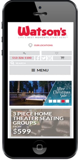
Responsive Magento sites provide a distinct advantage today. With the increasing use of mobile, tablets and phablets, responsive design necessary for adapting to the various screen sizes. Before responsive design, companies used separate mobile sites known as “m” sites. M sites often resulted in headaches for the merchant and often a less-than rewarding experience for the shopper. A responsive site is just one site, one database and one code that will adjust to fit the screen being displayed on – no matter the device.
The Advantages of Responsive Site Design
The real advantage of responsive Magento site design is that it’s one site to update, one database to manage, one code base to maintain, and one set of content for Google to index. This last benefit led Google to openly declare that responsive sites will rank above non-responsive sites of the same content quality (even if they have app-based mobile capabilities). The 2015 update left many eCommerce site owners scrambling to get their sites redesigned as organic traffic and conversions dropped. In some cases, traffic dropped 50% due to non-responsive sites. A responsive Magento site design leads to a better overall experience for your site visitors, as on page elements are properly scaled to fit the screen being displayed on.
In order to successfully build a responsive site, critical factors including UX/UI design, merchandising and site speed need to be blended together with the goal set for converting and promoting repeat customers.

$33 billion is what shoppers are projected to spend on smartphones, smart watches and tablet devices in 2016.
%
43% of consumers would spend more in mobile friendly stores that offer services such as mobile payments, loyalty programme, reservations, product availability checks, and location-based promotions.

$11.3 billion is what retailers could unlock in additional sales next year by creating a more mobile-friendly shopping experience based on consumers expecting an increasingly mobile shopping experience.
The development team at interactOne has experience in bringing all the elements necessary together for a truly remarkable Magento responsive site design. If you are looking for a Magento responsive site design, then contact us using the form down below or call us today at 513.469.7042 for a consultation.