The Secret Sauce of Search Engine Marketing

The Secret Sauce of Search Engine Marketing

Yes, we said it, the secret sauce is SEO.

Search engine optimization (SEO) is the process of increasing your website’s visibility in search engine results pages (SERPs) like Google, Yahoo, and Bing. In practice it is about making multiple impactful modifications to parts of your website. When viewed individually, these changes might seem like small incremental improvements, but when combined as a group, they can have a noticeable impact on your site’s user experience and performance in organic search results.

Let’s consider a few telling statistics:

  • 68% of online experiences begin with a search engine.
  • Google (+ Google Images) currently holds 91.94% of the total search engine market share, followed by Bing, Yahoo!, Baidu, and YANDEX. 
  • 61% of B2B marketers stated that SEO and organic traffic generate more leads than any other marketing initiative. 
  • 70% of online marketers say that SEO is better than PPC for generating sales. 
  • The top page listed in a Google search has an average click-through rate of 32%.
  • 75% of people never scroll past the first page of search engines.

The above stats from 2022 should be enough to convince you that SEO should be an essential part to the success of your eCommerce business.

In this blog, we’ll demystify the SEO acronym and discuss why it is one of the most important digital marketing tactics. We’ll also take a deeper dive into how to target the ideal prospects you want to find your website through their search efforts, so they are motivated to visit your site and convert to paying customers.

Why is SEO so important?

Do you ever look on the third page of a Google Search? Most likely, you never go that far in your search. And that is the same for 90% of respondents in the Searchengineland report. This is precisely the reason why SEO is so important.

Ongoing efforts should focus on both On-Page and Off-Page SEO. On-page SEO includes Content, Indexing, mobile views and effectiveness, structured data, security, performance, accessibility, technologies, branding, and domain. On-page helps search engines understand your websites content and what your brand is all about. In doing so, search engines can determine whether your site is relevant to what a user is searching for when they type a query. Investing time and effort into a solid on-page SEO strategy can provide a better user experience to meet your visitors’ needs while meeting your own needs via better search presence, brand awareness, and more traffic. Off-page SEO includes backlinks, traffic, Google Analytics, Local Directories, and Social Profiles. Both contribute a little bit to the total rank, position and overall authority score of a page.

Secret SEO Checklist Revealed!

What most SEO “experts” don’t tell you, and what we will, is that search engines are actually not that different from people. In the same way, you’d look for books in a library, skim-read their content, and judge their quality, search engines do the same. Only the process is a lot faster and more methodical.

​​Search engines value content that’s original, credible, well-researched, and engaging (like the work we produce for clients right here at InteractOne). And Search Engine Result Pages (SERPs) value websites that are fast to load, simple to navigate, and mobile-friendly. Websites with clear page titles, URLs, and links also are search-friendly. After all, these are the things you and your customers would look for when browsing online.

But how does an eCommerce marketing team optimize a website for search engines? By carefully crafting pages and content to make them as readable and valuable as they can be for your site visitors. Here’s a great place for your team to start:

  Choose niche keywords: It’s well-known that keywords are the words or phrases typed into search boxes when looking for something, for example, “Columbus takeout’ or ‘marathon training.’ Google looks for such keywords on websites and uses them to decide how relevant site content is to a specific search query. This means you need to choose keywords that align with your product or service and your customers needs or pain points and use them appropriately in content across your site. To identify your keywords, consider what your business offers and what makes it unique. Since many other businesses will likely share the same keywords, keep yours as specific to your offerings as possible. The trick is finding keywords with low competition and high search volumes. That’s where your expert team, like the folks at Interactone, needs to put in the work.

Relevant title and image tags: ​​On each page of your website, relevant title tags should be present. Title tags let Google know what is on your page, and are the main text element used in search engine results, therefore it’s important to choose keywords and phrases that match user intent and align with the purpose of the search.

Create quality content: You’ve heard it said time and time again that “content is king” and this is particularly true in the modern era of SEO. It is essential that you create unique and valuable content that is a worthwhile read for users. Whatever your industry may be, tailor your content according to the needs and pain-points of your audience. Stay on top of relevant trends, create “how-to” blog posts, and frequently update older content to make sure you’re continuing to serve your audience with useful and timely information, even after it’s initially published. For strategies on writing quality content, check out our blog, Content is King. Rule your Domain.

URL domain: An SEO-friendly URL must be easy for both search engines and readers to digest. How can you make it so?  Create URLs that accurately describe whatever content is on the page. This allows the customer to anticipate what they will see if they click the link and gives SERPs the ability to index your content better. Avoid keyword stuffing and looking spammy by including just one or two keywords. If there are any unnecessary words in the URL, remove them for conciseness, as you want to aim for three or four words maximum since shorter URLs tend to rank better. Eliminate any randomly generated numbers, too, as they are not descriptive, make the URL unnecessarily longer, and lack relevance. Some additional tips include the usage of lowercase letters and separating words with hyphens.

Create a good user experience: Make your website easy to navigate, with logical menus, clear page titles, and URLs that tell visitors what the page is all about. For example, instead of “www.trainers.com/123abc,” opt for “www.trainers.com/white-running-trainers.” Consider using breadcrumb trails at the top of your pages. These give one-click access to other pages on your site, and they’re good for SEO as you can weave keywords into them. So much of your online success is tied to the user experience of your website. Your marketing and development team need to be working in tandem to deliver a smooth and functional digital experience.

Make your site mobile-friendly: Given that nearly half of all searches are done on mobile devices, optimizing your website to work well and look great on mobile devices is no longer a nice-to-have but a must-have. And it’s something that search engines consider in their rankings, too. Google says mobile-friendly sites show higher in search results and account for over half of searches on Google.com.

Write unique meta descriptions: Meta descriptions are one of those small tasks that often get overlooked. Although Google has said meta tags are not a ranking factor, they are one of those small on-page SEO details you should incorporate into your content marketing strategy to optimize results. For tips on how to write unique meta descriptions, check out our blog, Meta Descriptions: Small Detail Costing You Big Traffic.

Fast page loads: Neither humans nor search engines like slow websites. In fact, one-quarter of visitors will abandon a site if it takes longer than two seconds to load. If you think any of your pages are running slowly, you might want to perform a quick analysis and identify any areas for improvement. For more information on page speeds, check out our blog, ​​Perfect Page, Poor Traffic? Why Site Speed Matters.

Outbound links: As previously mentioned, off-page SEO is just as important as on-page SEO. This involves building backlinks to your website from high-quality websites. You can do this by publishing guest posts on popular websites, participating in online discussions, and submitting your website to online directories such as Angi or Manta.

Specific Calls to Action (CTA’s): As its name suggests, a call to action (CTA) compels a visitor to take action, such as clicking a link to visit a product page so they can purchase a product/service. The better your CTAs are, the more conversions you will get, and the better your on-page SEO.

​​Optimizing your website for SEO with some of these checklist items won’t yield overnight success. How come?  It’s a long-term investment in creating a seamless user experience and unique, engaging content regularly. If you commit to this, you will reap the rewards by attracting higher-quality traffic to your site and happier customers who trust and respect you, your expertise, and your business offering.

Bringing it all together

It is no small feat to implement a well-designed and effective SEO strategy for your eCommerce website. SEO strategy is something that you cannot ignore or overlook when planning to expand your online presence. While there are many channels through which you can market your business, nothing can overpower the impact of search engine optimization tactics and strategies. All businesses with an online presence, whether small or big, should be opting to implement SEO tactics into their marketing strategies. But given the long list of tactics described in this blog, savvy eCommerce teams or choosing to put their trust in experts like the team at InteractOne to implement advanced SEO practices. If you need help with Search Engine Optimization challenges, let us know, below. We’re digital marketing pros and are here to help.

    Get expert help today!

    An InteractOne Senior Team Member will get back to you within a day.

    Drop Us a Line At:

    Our Contact Form

    Or, if you prefer an old-fashioned phone call:
    Phone (USA): (513) 469-3362
    4665 Cornell Rd. Suite 255
    Cincinnati, OH 45241

    Evoke Emotion & Encourage Sales with your Color Palette

    Evoke Emotion & Encourage Sales with your Color Palette

    Setting up an eCommerce website for your business or personal brand is an exciting step. Not only are you making an investment in the future success of your company, but you’re also making a statement by creating a public space for your brand. Once your eCommerce website is up and active, it will be the place where people go to learn more about your business,  and form an opinion about your brand.  Guests will be influenced consciously and subconsciously based on the color scheme you incorporate into the site’s overall design. And this visual influence will ultimately play a role in deciding if they want to spend money on your products or services. 

    That is why it is so important to create a color scheme that matches not only your brand but evokes the desired emotion you want your visitors to feel when they are engaged with your brand. 

    In this blog post, we’ll go into why you should care about website color schemes, what they can say about you and your brand, how to pick the right color palette for your website, and tools that can help get you started.

    What exactly is a website color scheme?

    It is simply a collection of all the colors you use on your brand’s website. This includes every design element — such as the text, backgrounds, images, shapes — no matter how big or small. If it’s on your webpage, it’s part of your website color scheme. (If you have corporate brand guidelines, these choices will be driven by that document. If not, this is an opportunity to develop one.)

    However, a color scheme is more than just the colors displayed on a webpage. It’s also the different weights that you assign to each color. For example, if you’re using bright red on your website, you’ll need to decide how big of a presence you want that shade of red to have in the overall look of your website.

    Why is your color scheme so important?

    Before we dive into the process of how to select the right color scheme for your site, it is important to understand why your color scheme matters so much. 

    Choosing the right colors for the design of your website is crucial for your online success because they gain a reaction from your targeted audience. Colors can be  used  to stir your visitor’s emotions, to peak their interest – a simple color can become synonymous with a brand and choosing the correct color scheme can  increase brand recognition and extend beyond your website.  

    Think about your favorite brands — what colors do they conjure up in your mind’s eye? For instance, do you think of blue when you think of Tiffany’s? Red when you think of Target? Yellow when you think of McDonald’s? If you answered yes, and happen to go to any of those brands’ websites, you’ll likely see those colors prominently featured. You have the same opportunity with your website design – to make a similar impression on your customers with the colors you choose. 

    When deciding on how to make that impact, your color scheme is the first place you should start. Remember to be mindful of color psychology and the effect color can have on the emotions of your site visitors. While it’s not a requirement to follow the “rules” of color psychology, it can help you focus on the message and feeling you want your site to convey.

    Here’s a quick overview of color psychology, and what different colors might convey:

    • Red: A bold color that evokes strong emotion. With its intensity, it creates a sense of urgency. For example, Target. 
    • Orange: Cheerful and confident, orange conveys the idea of enthusiasm. However, it can come off as the color of caution as well. For example, Amazon. 
    • Yellow: Like orange, yellow provides a cheerful feeling. It represents optimism and is usually attention-grabbing. One thing to consider, however, is that some shades can strain the eye. For example, McDonald’s.
    • Green: Represents growth and nature. It signifies health, serenity, and tranquility. It is associated with wealth. For example, Starbucks. 
    • Blue: This color is associated with water, and provides a feeling of calmness and serenity. Blue creates a sense of security and trust and is often used for corporations. For example, Facebook.
    • Purple: The color of wealth and success. It’s a powerful color, but also represents creativity. For example, FedEx.
    • Brown: Friendly, earthy, and commonly represents the outdoors. For example, UPS.
    • Black: A color with a sophisticated feeling. It’s often what we think of with “sleek” brands because of its exclusivity and mystery. For example, Nike.
    • Gray: Provides a feeling of security, reliability, and intelligence. For example, Lexus.
    • White: Provides a clean or neutral feeling. It’s a key color because it adds breathing room and what is referred to as “white space.” For example, Adidas.

    If you already have a logo or brand colors ask yourself, do they evoke the emotion you want from your customers? If not, it may be time for a redesign to focus on  colors that test well with your audience and connect with your industry.

    .

    How to choose the right color scheme for your website:

    A little research in color theory and color psychology can go a long way in helping you choose the right color palette for your website. Everyone wants to get their site up and running as soon as possible, but there are a few things you should consider before you hit Publish that you should know:

    Who Is Your Target Audience: Before you decide on website color schemes, you should do some research into which colors are most popular among the people you’re trying to connect with. For example, if your target audience is men over 50, you’re probably going to choose sleek blue and gray tones over bright pinks and yellows.

    Which Colors Are Your Competitors Using: Certain industries tend to gravitate towards specific colors. For example, wellness brands tend to use a lot of neutral, earthy tones, and children’s brands typically use pastels or bright, playful colors (imagine a child’s brand that relies heavily on blacks and grays). Yes, you want to stand out from your competitors, but you don’t want your color choices to confuse or alienate your target audience so look into different variations of similar colors to ensure you stand out.

    Do your research: The colors you use in your web design will affect how people perceive your brand, whether they realize it or not. As we discussed above, your first step in choosing your website color palette should be researching color theory and color psychology to learn how different colors are related to different emotions.

    Keep up with industry trends: Having a better understanding of color trends gives you great insight into what’s emerging in the marketplace, helping you create a website that is new & progressive. Note: Change for the sake of change isn’t always a good thing. Too much change to keep up with the times can confuse your customers so be sure to continuously test what is working and what is not. 

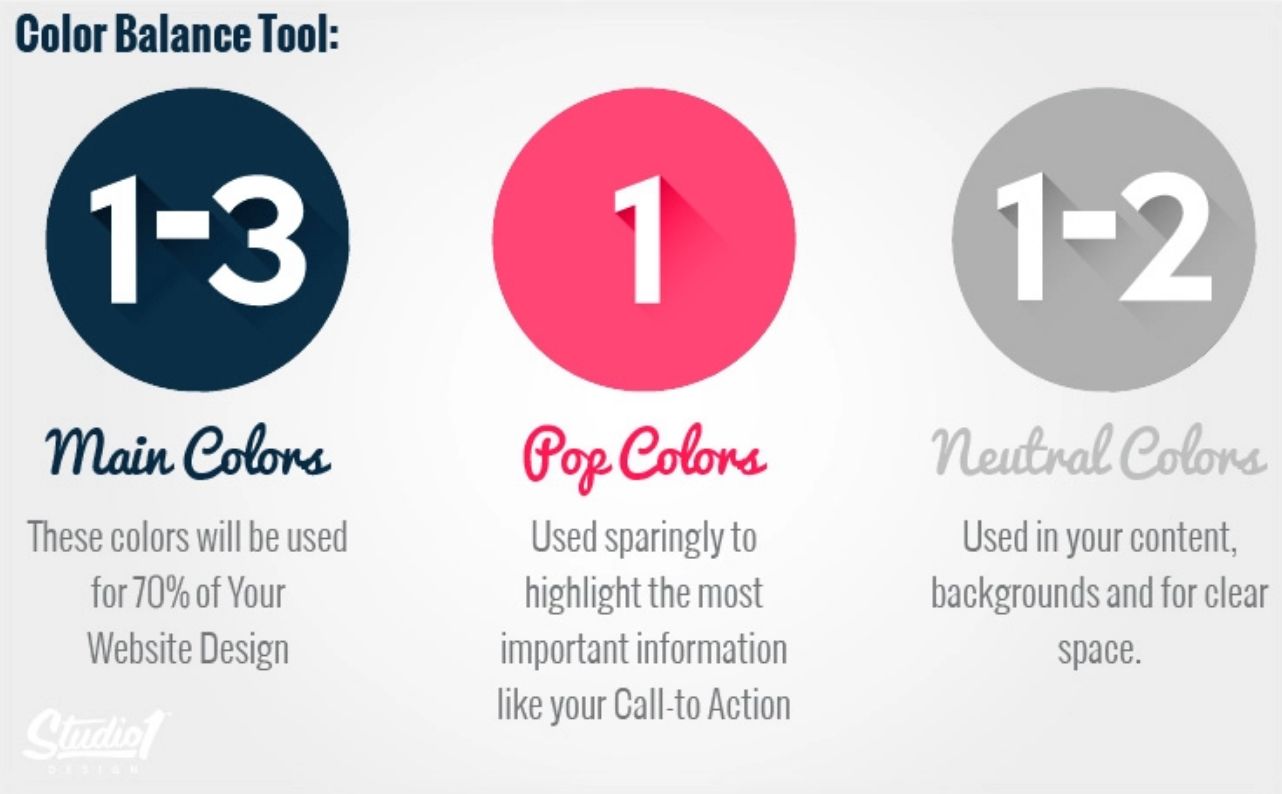
    Ensure you have balance: Think about the color harmonies, usually when deciding on a color palette you’ll begin with the dominant color as it will hold the most weight on your website. For instance, Target’s dominant color is red. From there, work your way back to lighter colors to compliment your dominant color. Use the below balance tool as a reference once you are ready to get started. 

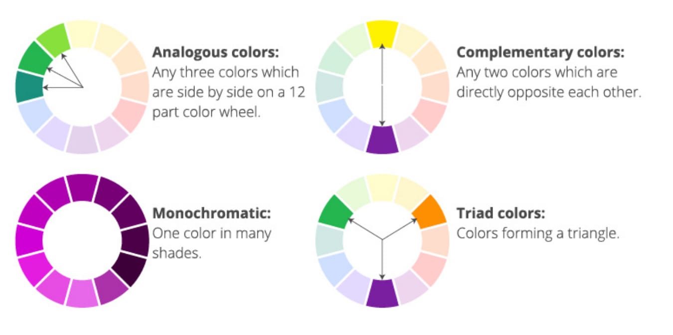
    The easiest way to select color combinations for your site is by using the color wheel and applying the principles of analogous, complementary, monochromatic, and triad color harmonies.

    As you select your colors, remember that the types listed above aren’t definitive rules. They are meant to give you a general idea of the overall feel you want your site to have, but they’re by no means the only ways to create a palette that works for your brand. In addition, be careful about using too many colors as they risk competing against one another and causing eye fatigue or overwhelming your customers. How do you get around this? Introduce new experimental colors in small quantities to reduce risk.

    Where to find color inspiration for your website:

    Inspiration is everywhere, it can be found in the outdoors, by studying different design fields, watching your  competitors , and by staying informed with web/ branding trends. To help you on your color journey here are some of the trusted, easy-to-use resources we recommend: 

    Pantone: Pantone is the design industry leader when it comes to choosing the right colors and provides the latest in color trends across all forms of marketing and graphic arts industries. Pantone is a physical color index and the perfect tool for any designer or business crafting products that are printed. 

    Pinterest: Pinterest holds an impressive amount of color palettes created by designers and creatives all around the globe. Simply search by color, season, or theme for instant color inspiration.

    From bright Pantone swatches to colorful idea boards, dedicated color websites and blogs can be a great way to experience unique color combinations you might not have thought to try otherwise. Try the below free sites for instant color palette inspiration.

    Paletton: This color palette generator is great because it has several different modes, such as a color-blind simulation. It’s also useful for seeing how different visitors will view your color scheme, which is especially helpful if you can’t do a lot of in-person user testing on the site.

    Coolors: This handy tool is great for testing different colors next to each other. Featuring a drag-and-drop interface, it allows you to not only customize your color palette but move things around to see what looks best or clashes next to another color. 

    Canva’s color wheel: This colorful tool by the Canva team is a great resource for picking out a new palette and for learning even more about the color theory we referenced earlier. It’ll help you discover different combinations based on those theories, so you know your decision is backed by art and science.

    BrandColors: BrandColors shows you how leading brands use color to differentiate their businesses, tell their brand stories and let their customers know what they stand for. You can scroll alphabetically through a list of corporations, nonprofits, and startups, or search by brand name.

    If you already have images, logos, or branding that your website colors have to match consider using sites like Color Hunter, Adobe Color, Paletton, or Hex Color Scheme.

    Test out the final product

    When you’re finished choosing your colors and designing your website, you’ll need to test it out to see how it will look when it goes live. Think about it: you test your CTAs, headlines, and other website elements. Why should color be any different? A website behavior analysis tool like Crazy Egg offers the perfect opportunity to figure out how your audience responds to your current color palette and can help you make better-informed decisions on the overall design and palette of your website. For example, you are creating a website for a sports team who normally gravitate towards bolder, darker colors, but you decide to choose the colors pink and blue and you find out during the testing phase that your audience doesn’t like it or doesn’t react how you want them to. Without testing, you would not have known this feedback and wouldn’t have had the opportunity to change it.

    Bringing it all together

    When it comes to running a website or a business (or both!), it’s always a good idea to look for ways to simplify basic processes. After all, the less time you spend on basic tasks, the more time you’ll have to spend on processes and decisions that have a bigger impact on your success.  And when you have an established color scheme, you make basic design choices much easier, both for yourself and for your designers and developers. Are you ready to incorporate the right color palette onto your website to evoke the right emotions with your customers and need expert help?

      Get expert help today!

      An InteractOne Senior Team Member will get back to you within a day.

      Drop Us a Line At:

      Our Contact Form

      Or, if you prefer an old-fashioned phone call:
      Phone (USA): (513) 469-3362

      4665 Cornell Rd. Suite 255
      Cincinnati, OH 45241

      The October 2021 Orange Report

      The October 2021 Orange Report

      October 2021 ORANGE REPORT

      The October 2021 Orange Report features our best & most recent blogs and guides on Magento, Big Commerce, eCommerce, and Digital Marketing.

      Orange Report Logo

      Conjure Sales & Build Trust – The Magic of Mobile Marketing

      In Part 1 of our Mobile series you’ll learn the benefits and best practices of SMS mobile marketing, including how to stay compliant with examples of customer texting done well.

      Video Case Study: Automotive Aftermarket

      See for yourself how InteractOne migrated an Automotive Aftermarket website from Volusion to Magento 2 and improved mobile-responsiveness and functionality.

      How to Run a Successful Mobile Marketing Campaign

      In Part 2 of our Mobile series we’ll provide some great examples of mobile messages to send to your customers including special promotions, mobile coupons and encouragements.

      Apple’s iOS15: One person’s privacy is another’s marketing strategy

      Privacy concerns for users are real, and Apple is about to strike a blow in how business is done that could change the marketing landscape in a major way.

      Apple’s iOS15: privacy & marketing strategy

      Apple’s iOS15: privacy & marketing strategy

      Apple’s iOS15 Update: One man’s privacy is another’s marketing strategy.

      That’s a cold, hard fact in the digital age for those engaging in eCommerce. Tracking, the electronic following of activity by those who have engaged with your brand, has become such a norm in how commercial ecommerce activity operates that companies hardly bat an eye over engaging in it at this point.

      But privacy concerns for users are real, and Apple is about to strike a blow in how business is done that could change the marketing landscape in a major way.

      Apple’s new releases this fall on its Mail app on iOS 15, iPadOS 15, and macOS Monterey devices will offer a Mail Privacy Function. According to a recent report 13.3% of respondents said they used the Mail app to open and read their personal emails. With a flip of a switch, tracking the activity of these users without their permission becomes virtually impossible. As they so often do, Apple has highlighted their commitment to innovation in this area with a humorous and engaging commercial. The introduction of such functionality could be the most substantive move yet in giving consumers control over who collects their data, but it surely won’t be the last.

      Let’s look at what is ahead with these changes and what strategies you can consider for your eCommerce marketing so you can adapt.

      Anti-Tracking and iOS15

      A bedrock tool in digital marketing that involves tracking is the inclusion of an invisible pixel in email that is accessed by consumers. With the Mail Privacy Function in iOS15, those who open emails will determine whether that tracking data should be shared back to the source. Information like whether you opened an email, how many times it was viewed and if it was forwarded will no longer be available from any readers who choose to block them.

      The Mail Privacy Function also will block the email receiver’s IP address, so digital marketing strategies that rely on mining information that way to discern the user’s location and online activities are also going to be shut out.

      Another Apple innovation that is going to throw a wrinkle into established marketing tactics is an option known as Hide My Email. Users will have the capability to have Apple create an artificially-generated email address when they do things like make a purchase. That new email address will then forward to the user’s actual email, keeping knowledge of that email address away from eCommerce companies and others who would want to use it for marketing purposes.

      Measures such as these that are coming with iOS15 are going to require an adjustment in tactics for those who have built their marketing around gathering intelligence about customers through these channels.

      Preparing for Change

      So, with these changes in the offing, what can you do to keep your eCommerce marketing efforts moving forward? A great place to start is making sure your fundamentals are in order so that you aren’t causing yourself difficulties in places that ought to still be strengths. It’s unlikely  that there will be a magic bullet approach for dealing with the changes that Apple is introducing into the market.

      One good thing you can do immediately is making sure your email lists are as clean as you can make them. Don’t clutter your marketing efforts by allowing bad information in from the start. You want your marketing hitting with people who already are customers or who have shown very strong signs that they could be customers.

      Another route you can take to strengthen your marketing results is moving from an approach  less reliant on email tracking to one with a more engaged approach. If you aren’t already doing it, try introducing pop-up windows on your site for visitors who may be willing to share their information because they are finding your product offerings and/or blog/articles content attractive to their desires. This kind of first-level information is always going to be better than the results you see from a tactic like tracking because you will know the user is open to receiving information and updates from you. You also have some advantage that can be used in setting up effective pop-ups in that you know what channel has brought the visitor to your site in the first place. Use that information to inform the tone and character of the pop-up you are asking the visitor to respond to.

      How closely are you looking at how you communicate with your customers? People are savvy enough to know when they are being targeted by mass marketing, and are less likely to respond. By improved analysis of your market segmentation, you can create messaging that feels more personal to the target, thus increasing the chances they will be willing to respond. Apple’s efforts are meant to cut out involuntary marketing activity that potential customers are being subjected to. A great counter-strategy for you to consider in light of this is using what you do know about proven customers to create messaging to which you strongly believe they are going to be receptive.

      Additional Steps to Try

      The changes from iOS15 will have impacts on how you market beyond what is first apparent when you initially think about this subject. Consider, for instance, your email funnels. These funnels operate on a series of interrelated decisions involving the monitoring of how targets are responding to previous emails. If Apple’s new tactics are telling you that a prospect isn’t engaged with one of your emails when in fact the opposite is true, that is going to throw a major wrench in how your email funnel is supposed to work.

      If your marketing falls utilizes these techniques, you are going to need to consider reconstructing the rules that your email funnels use for their internal decision-making.

      Related to this type of approach, the need to rely more heavily than ever on testing is made apparent by this change in the market. Even with these new developments you are not going to abandon email marketing at this point. Even if Apple’s tactics are taking a segment of your customers out of the data you are making evaluations from when you test subject lines or send times, you are still going to see valid results from trends in the market overall from non-Apple users and those Apple users who aren’t using the new privacy software.

      Your overall open rates and other metrics may go down from an impact from these new factors, but it doesn’t mean you can’t still effectively identify those email marketing practices that are performing best for your business, and that is still important information to operate from in figuring out your best strategies.

      Conclusion

      Users like the idea of having their data protected. Apple isn’t the only company working to roll out solutions on this front. Staying on top of these developments will require diligence.

      What goes on in this space of the marketing world is a conversation that is just taking off. It’s going to be worthwhile for you as an eCommerce provider to stay on top of this topic and adjust accordingly, as it has the potential to significantly impact future business results.

        Get expert help today!

        An InteractOne Senior Team Member will get back to you within a day.

        Drop Us a Line At:

        Our Contact Form

        Or, if you prefer an old-fashioned phone call:
        Phone (USA): (513) 469-3362

        4665 Cornell Rd. Suite 255
        Cincinnati, OH 45241

        How to Recover Baskets of Money from Shopping Cart Abandonment

        How to Recover Baskets of Money from Shopping Cart Abandonment

        No matter how smart and hard retailers work to bring customers to their website and lead them throughout the shopping process, only three out of ten shopping carts will generate an order. That is a significant amount of lost revenue. It hurts double if the sale winds up going to your competition.

        While all retailers find shopping cart abandonment a big issue, some see it as an opportunity to gain an advantage against the competition. In this blog, we’ll reveal why those issues emerge and how to address them.

        Before diving into some solutions for cart abandonment, it is imperative to first know your brand’s cart abandonment rate.

        How to calculate your shopping cart abandonment rate

        Although the average cart abandonment rate in eCommerce varies based on the industry you are in, it usually is somewhere in the ballpark of 70%, (Baymard, 2019). Ecommerce sites with longer decision-making cycles such as travel can experience rates as high as 80%.

        So, how do you determine the average cart abandonment for your brand? You can calculate it by using the formula below from Tidio:

        The higher the cart abandonment rate, the greater the financial loss for the company. Unless you stop customers from leaving with solid solutions to either stay or come back and complete the order. 

        Here are the top cart recovery solutions you should consider:

        Authenticate Your Brand with Social Proof

        Consumers want to see more than just what you are selling. According to Stackla data, over 86% of digital consumers decide to support brands based on how authentic they are perceived to be. Additionally, 60% of these consumers believe that publishing user-generated content is the best way to show authenticity – insert blog content or social images that depict more than just your product. Given this data, one of the best shopping cart abandonment solutions to implement actually has nothing to do with the checkout process and has everything to do with you and how you present your brand.

        You can take strides toward getting shoppers to trust your brand by offering real customer reviews and trust badges. Highlight these on your product pages and within your cart abandonment workflow. Another avenue is to use your social media accounts to encourage customers to share their experiences with your brand, both positive and negative. These two simple and low-cost strategies will go a long way in helping to reduce cart abandonment.

        Retargeting ads using PPC

        Retargeting/remarketing ads allow you to stay in front of interested individuals who may be close to converting.​ When a customer visits and leaves your website, a remarketing campaign displays your banner or text ad on other sites they visit, including social websites and apps. Remarketing campaigns drive prospective and previous customers back to your site, reducing shopping cart abandonment and providing better audience segmentation while building brand awareness. Delivering a specific message to your customer based on where they are in the buying cycle – in this case the Shopping Cart, though remarketing can be used earlier in the buying cycle as well -, and selecting imagery based on what pages they visited while on your site is key to delivering the highest possible ROI for your remarketing budget.

        To optimize your remarketing efforts, it is also important to segment your customers in detail. You need to consider things such as; the item(s) they were purchasing before they left the site, the value of the item they abandoned, and whether they were a first-time customer or not. This can help you re-engage shoppers long after they’ve abandoned your site with the proper segmentation messaging that will likely increase your clicks and conversions. It can also help you increase profits and overall customer satisfaction.

        To learn additional steps and strategies to help you get started with all forms of Search Engine Advertising, read our blogs 5 Ways an Integrated SEO PPC Strategy Will Benefit Your eCommerce Business and SEO and PPC: It’s Easy as 1,2,3.

        Strike While the Iron is Hot with Automation

        When using email automation workflows for cart recovery, timing is critical so you need to be sure you strike while the iron is hot; which is usually within one hour of abandonment. After the initial email has been sent, you can set up two or more to improve your chances of recapture – though it is important to remember here  is not to overdo it.

        With the right software or agency support/assistance, certain actions (or inactions) can trigger pre-crafted messages to send automatically to customers soon after they leave their carts behind.

        Whether you decide to work with an agency or use software – your email automation should be able to do:

        • Send automatic welcome emails when someone subscribes to your newsletter or creates an account on your site
        • Allow for a behavioral trigger, like abandoning a cart or browsing a certain product category
        • Engage your customer post-purchase with the order confirmation and shipping notifications
        • Send automatic timed responses based on birthdays to nurture your customer relationship
        • Create timed-based triggers to re-engage inactive customers

        Key Concepts to Include in Your Automated Emails

        Bringing in additional strategies into the mix will make your email campaign even more powerful and continue to decrease your cart abandonment rate. Some of these strategies include:

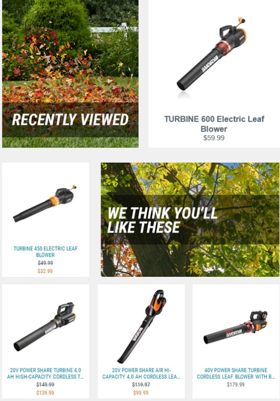
        Feature the abandoned product in the email: remind your customer what they are missing out on by providing exact details; the image, size, color, and price of the item within your initial email. For subsequent emails, including recommendations for similar products might improve chances of conversion, as well. Worx has a great follow-up email that reminds customers what they left behind with additional item suggestions:

        Use high converting subject lines: a catchy subject line like Perigold’s grabs your customer’s attention and helps increase open and click rates.

        This is a strategy that can translate across all of your marketing strategies. Once you’ve come up with a catchy subject line, it is important to test them with sample audiences to find out what’s working and what’s not before you make a campaign live. 

        Our blog posts Subject Line Tactics and Email Best Practices dive deeper into testing subject lines and offer some tips and tools you can use to help increase your open rates.

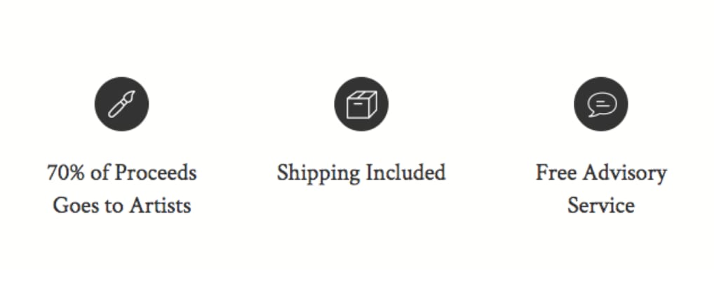
        Offer support: customers might abandon their cart because they had questions (i.e. return policy, sizing) or were having technical issues. Allow them to ask questions if they have them whether on your actual site or in your first email touchpoint. Saatchi Art does a good job in their follow-up email of highlighting where a customer can go for help should they have questions before they order:

        Offer incentives: regardless of the industry you are in, any good eCommerce or digital marketer knows that building a great email list is often done with some kind of incentive to sign up, like a discount or free shipping similar to the offer Saatchi Art provides in their follow-up email below. When you offer an incentive, either in a timed or an exit-intent pop-up, the welcome email will likely be opened immediately.

        Have a clear CTA: put a bold, easy-to-see, contrasting CTA right below the product image that the customer left behind pushing them towards the action you want them to take; purchase the product. Specialized entices customers the item they left behind is worth a second look with their clear CTA:

        Let’s break it all down with an example

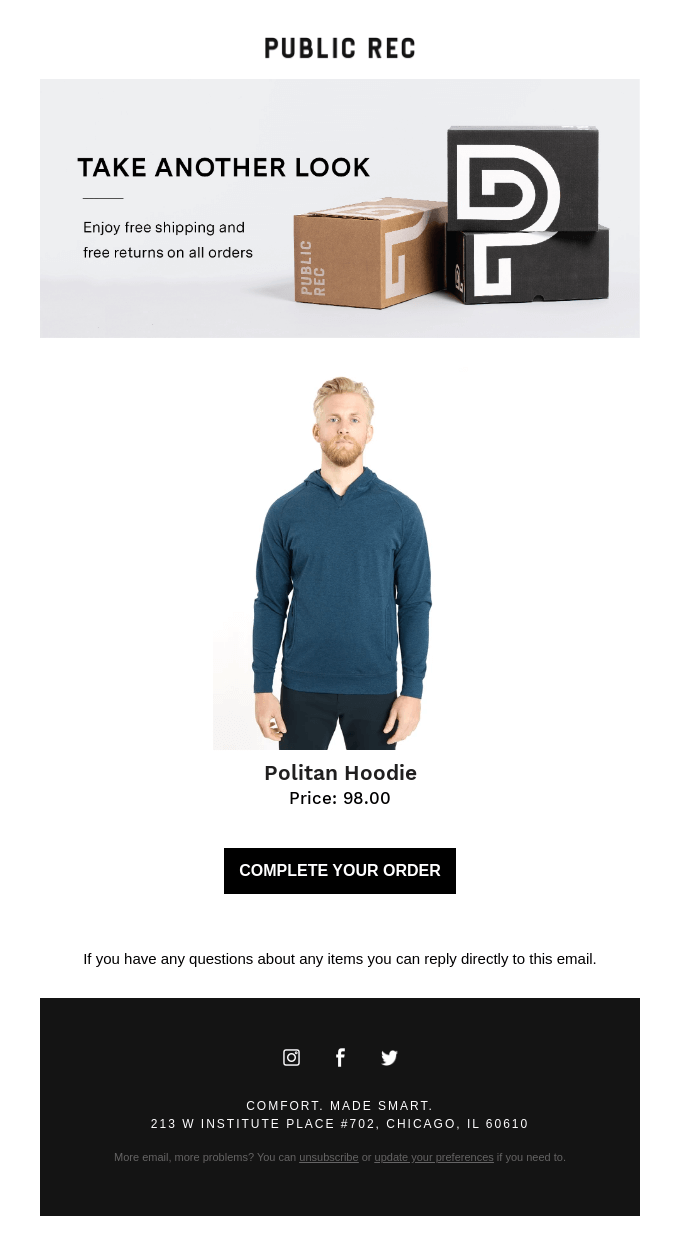
        As mentioned above, a catchy subject line or incentive will grab your customer to come back. Let’s look at the good and bad of the follow-up email below from Public Rec to help inspire your email automation campaign.

        What is good about this automated email?

        The subject line positively defines the abandoned product as worth another look for the shopper.

        • While there is no discount, the verbiage used can be powerful enough to create a conversion.
        • A distinct CTA is provided making it clear and obvious where to click and what action you want them to take.
        • There is mention of FREE shipping costs. The cost of shipping is a top reason for abandoned carts and including that here could be powerful enough to create conversion.
        • There is mention of FREE returns. Consumers want to feel confident in their order, especially first-time customers. Reinforcing whether or not you offer a return policy can make completing their purchase seem like a no-brainer.

        What is bad about this automated email?

        The subject line positively defines the abandoned product as worth another look for the shopper.

        • There is NO customer service information. A link to a help page, live chat, or general phone number is not represented and could be useful to a customer.
        • There are NO other product recommendations included in the email.

        Bringing it all together

        We understand that cart abandonment is a complex issue for all eCommerce businesses and there is no single solution that works across brands and industries. Overall, retailers need to understand the reasons behind why a shopper abandons their cart.

        Do they simply need a reminder or do you need to offer a discount? Maybe it is the return policy that is the hurdle to overcome. Or maybe you need to provide product recommendations to increase their shopping cart to qualify for free shipping.

        Creating an email strategy can help your customers overcome those concerns and bring shoppers back while also recovering baskets of money in revenue.

        Are you ready to reduce your cart abandonment rate, boost conversions, and take your business closer to its maximum revenue potential? Connect with one of our experts today to discuss your eCommerce needs!

          Get expert help today!

          An InteractOne Senior Team Member will get back to you within a day.

          Drop Us a Line At:

          Our Contact Form

          Or, if you prefer an old-fashioned phone call:
          Phone (USA): (513) 469-3362

          4665 Cornell Rd. Suite 255
          Cincinnati, OH 45241

          How to Optimize Your Apparel eCommerce’s Product Pages

          How to Optimize Your Apparel eCommerce’s Product Pages

          Your product pages hold all the relevant information about the garments you sell. Most product pages include the product description, cost, customer reviews, images and call to actions. While many consumers enjoy viewing high-quality pictures of the clothing, it is not enough to drive sales. Instead, you want the user experience on your product pages to persuade shoppers to add items to their cart that ultimately lead to a transaction. If your conversion rate could use that extra boost, here is a guide on the best ways to optimize your apparel webstore’s product pages.

          Write Unique Product Descriptions

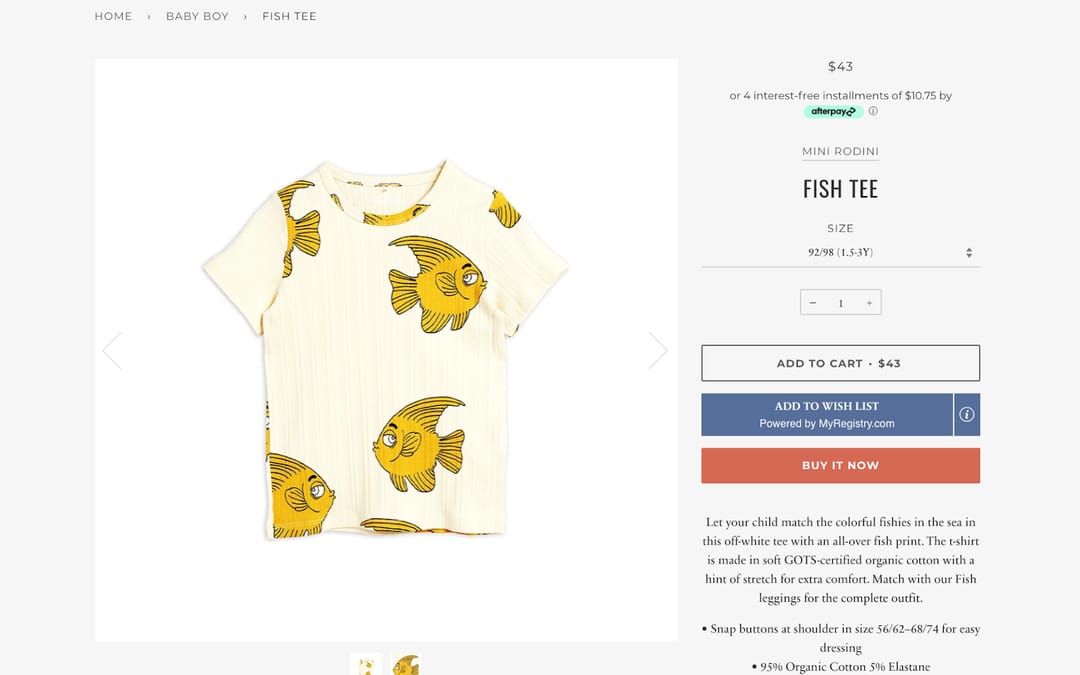
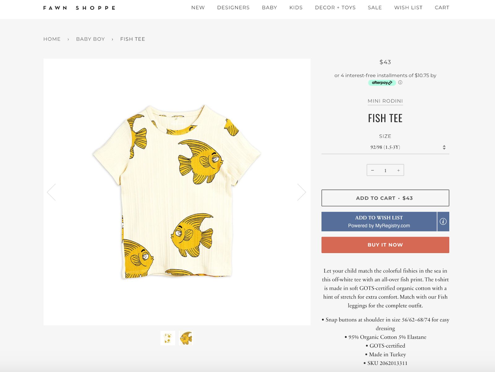
          Product descriptions are where your apparel brand’s writer can get creative. Creative product descriptions add life and personality to a garment. This personality is a showcase of who your brand is. Showcasing your brand’s personality throughout all the elements on your website will help you gain credibility and trust from your shoppers. The Fawn Shoppe has fun product descriptions for their children’s clothing:

          This section of your product page is where your brand will describe the piece of clothing — the material, the color, the design, the different elements and any other relevant information. Every description needs to answer obvious and frequently asked questions that shoppers may have about the product. Always remember to include enough details about each product, so the customer knows exactly what they are buying.  Product descriptions can also help with your SEO efforts. In general, your brand will rank higher in search engines if each product has a unique caption. No matter how tempting it is, do not copy and paste manufacturers’ descriptions or use description generators. Generic manufacturer description will actually drop your ranking due to the original caption already ranking for the first website. 

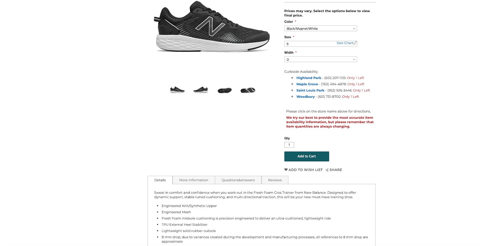
          A company that InteractOne works with, Schuler Shoes, includes unique, structured product descriptions that not only provide details but more information and questions and answers sections:

          Allow Customers to Write Reviews

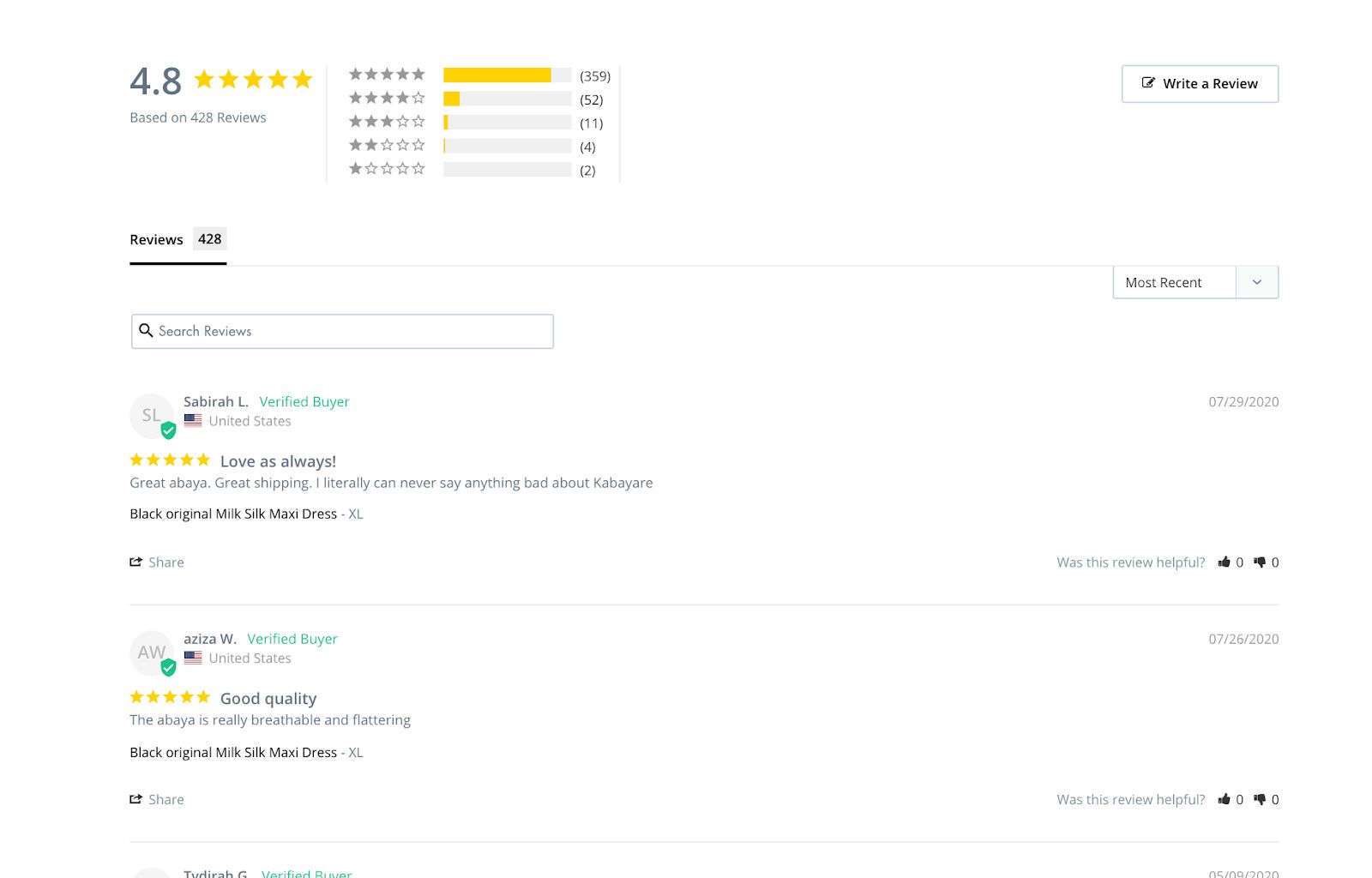
          Reviews can play a huge role in helping a customer decide if they buy the clothing you are selling. On average, companies that include customer reviews have converted 58% more customers, increased revenue by 62% and increased order value by 3% over other webstores. Simply put, social proof is more important than ever and many shoppers look for reviews to explain the quality, the sizing and FAQs around products. When it comes to apparel, consumers also like to see how the piece fits on another person similar to their body type. Reviews are important for every type of eCommerce; however, since you can get a real image to show how the apparel items look on an actual person, you have a higher chance of gaining more reviews and customers if you allow reviewers to post images along with their written opinion. Some brands also allow customers to choose the size they are commenting on and their location. 

          Kabayare Fashion provides an excellent example of including customer reviews on their products:

          Include a Clear Call to Action

          An important element on your product pages that needs to be fully optimized is the call to action (CTA.) This is where users will click and add the item to their cart. On all your pages, you need to place your CTA front and center and not around any design or copy elements that would be distracting. Keep the copy inside the button simple and direct like Add to Cart, Buy Now or Reserve Now. If you are not sure if your CTA buttons are working, you can A/B test the design, placement and copy. You can spend hours A/B testing on your own, but a knowledgeable marketing firm can efficiently and quickly zero down onto the issue and fix it right away.

          Use Unique, High-Quality Media

          One of the first elements that customers will see once they enter your product page is its media. When we refer to media, we’re referring to any images, graphics or videos. All the media on your product pages need to be unique from each other and high-quality so shoppers can see everything. For product images, include different angles of the product, and for videos, show a 360 degree shot of the items. While working on your media, especially images, keep the dimensions and specifications as uniform as possible. This will help your user interaction and keep your brand looking professional. Customers, especially mobile users, prefer square photos and thumbnails. And, many companies like Amazon and Etsy use 1000X1000 pixels as their image requirement. Feel free to play around with image sizing on desktop and mobile before publishing the page live for shoppers to see. You can also add extra viewing tools like zoom controls so they can see even more details and embellishments up close.

          Utilize SEO

          As you already know, SEO is search engine optimization, which is the process of improving your website to increase its visibility on search engines like Google. Just like every other page or element on your website, product pages are an SEO-rich area. Optimized SEO on your apparel eCommerce’s product pages will help your brand rank higher in search engines. To have a fully optimized SEO, you will need to include all the SEO basics like unique title tags, meta descriptions, long-tail keywords, internal links, etc. If you want to dive deeper, we have an SEO checklist to help drive sales. Once you have the basics down, you can then include advanced SEO measures for better-optimized product pages. Since there are many elements, steps and requirements that go with setting up the perfect SEO, many companies prefer to work with a marketing team like InteractOne to help your brand’s SEO reach its fullest potential.

          Include Social Media Proof

          To not confuse social media with reviews, reviews are the content generated by customers that stays on your site, while social media is content created by your customers, influencers or even yourself that lives on the social media platform it was posted on. Social media is not for every apparel company but it can help out your product pages if your brand does use it. Just like how reviews help potential customers understand how others like the product, social media will help as well. People prefer seeing how the garment fits on another person similar to their size. The more social proof on product pages, the more potential customers you can reach. Social media proof on product pages also adds credibility and trust to your brand and clothing items. To learn more about how your brand can best utilize social media, we created a guide on the best social media tactics to use to increase traffic.

          Stay on Brand

          All the content on your product pages, whether it is images, videos, graphics, social media or copy, needs to reflect your brand. New and old customers should be able to recognize your brand instantly with every product. To stay on brand, follow the guidelines that your company created. Having a brand guide is vital in creating and implementing any designs, copy, graphics, videos and any other content you want to use. Essentially, how can you stay o brand and on message if your brand isn’t defined? That’s where you create a brand guideline that determines who and what your brand is. Once you understand the who and what about your brand, you can take that personality to the digital world. These guidelines need to include your brand’s copy and design elements, as well as your target audience.

          There are many more ways to optimize your product pages. We even have a guide on the keys to a successful product page. To learn how InteractOne can help you increase traffic on your product pages and throughout your apparel webstore, contact us today.

            Get expert help today!

            An InteractOne Senior Team Member will get back to you within a day.

            Drop Us a Line At:

            Our Contact Form

            Or, if you prefer an old-fashioned phone call:
            Phone (USA): (513) 469-3362

            4665 Cornell Rd. Suite 255
            Cincinnati, OH 45241

            Chassis Codes 101: Integral Spec for Automotive Aftermarket

            Chassis Codes 101: Integral Spec for Automotive Aftermarket

            The organizational structure of your product catalog is the backbone of your eCommerce store. After all, it’s pretty difficult to sell products if your customers can’t search for and/or find them. What that means for your store is that you need to categorize your product listings in every relevant way possible to ensure that your shoppers don’t come up empty-handed when they’re browsing for a component.

            Every competent aftermarket automotive shop has that functionality built in with products categorized by vehicle year, make, and model. However, one very important (and potentially lucrative) spec is missing from most automotive product listings: the chassis codes of compatible vehicles. In this guide we’ll break down the need for Chassis Codes and how to incorporate them into your automotive aftermarket website.

            What Are Chassis Codes?

            Essentially, a chassis code is like a meta description of a vehicle. It designates what chassis a car is built upon, which is often shared across numerous models and makes. For example, the LX chassis platform owned by Chrysler was used by the Chrysler 300, Dodge Magnum, and Dodge Charger produced from 2005 to 2010 – two brands and three models built for five years, but only a single chassis code.

            If you want a more in-depth crash course on chassis codes, Speedhunters has a great write-up including a lot of the most common models that car enthusiasts will be shopping for by chassis. And Active Auto shows a great example of Chassis Codes. 

            Why Do Customers Shop By Chassis Code?

            The main reason customers search for aftermarket parts by chassis code is simply that it’s easier. Instead of repeatedly typing in the year, make, model, and trim of their vehicles – keywords which often aren’t even featured on product listings – shoppers simply type a two- to four-digit chassis number.

            Another reason shoppers turn to chassis codes is that product listings often don’t include every model of compatible vehicle. In many cases that would be impossible – some components would have to feature sprawling lists of dozens of models to include every compatible year and trim level.

            On the other hand, a single chassis code keyword can give shoppers all of that same compatibility information without having to scroll through endless lists.

            How to Incorporate Chassis Codes into Your Web Store

            Here’s where things can get a bit tricky. Most likely, all of the meta data for the products featured on your store is scraped from supplier databases. That means you’ll have to wade into the back end of your website to automatically update your listings and include chassis codes Magento or BigCommerce product attributes are useful when mapping chassis codes and vehicle qualifiers to products because you can set specific attributes to display on the product pages, be searchable in the site search and filterable from category pages. However, that’s just the first step – you still need to create content to help rank for those searched chassis terms and show customers you’re relevant and reputable in the industry. 

            Luckily, there’s an easy way to take advantage of this marketing solution with some hands-on content:

            1.  Identify a number of vehicles and compatible chassis codes that you want to target with your marketing.

            2. Create a separate page or blog post dedicated to each chassis code.

            3. Make the pages SEO-friendly and include a relevant H1 title. For example, “A List of Upgrades Compatible with the Chrysler LX Platform”.

            4. Write some brief, keyword-rich content that is relevant to the chassis code. Mention vehicle years, makes, models, and trim levels that fall under the chassis code to make your content even more searchable.

            5. Include a list of compatible components that you sell arranged by category. You don’t have to include every part you offer, but be sure to highlight your best sellers and highest margin products.

            A. Mapping chassis codes to products can make this a breeze, and automate lists as you update product data.

            6. Share those pages via social media, email them to target segments of customers you know have those vehicles and try distributing those links to suppliers or enthusiasts to link back to your site now that you’ve created a valuable reference resource.

            7.  Repeat the process for every chassis code you want to target.

            Conclusion

            When you’re finished, you’ll have a repository of relevant, SEO-friendly pages for shoppers to land on for years to come whenever they type their vehicle chassis codes into Google. That should help you scoop up a ton of new customers even without making back-end changes to your product categories and databases.

            Of course, if you do want to go all-out and optimize your product listings to increase sales volume and user experience – or if you merely need help creating quality chassis code content and marketing it properly – Interact One has your back.

            Supplements & Vitamins Checklist: Pages your eCommerce site MUST have

            Supplements & Vitamins Checklist: Pages your eCommerce site MUST have

            As the owner of a pharmaceutical or supplements eCommerce store, you want to keep your customers engaged and informed on your website. One of the first steps to do this is to make sure that your website’s pages give your customers a holistic view of your company and allow for transparency. But which pages are most vital — and what best practices should you be implementing for these pages? 

            Keep reading to learn what your most important pages must include to keep up with the competition and keep your audience satisfied.

            Homepage

            Imagine your homepage as the storefront of your business. It’s an essential element of your site,, as it’s what invites people in and gives them a little glimpse into what they’ll find throughout your site. This is also the place to tout your unique value proposition and any special offers or big sales. In addition, the homepage is the hub of the links to all internal pages on your site. 

            Research has shown us that featuring your most popular, best-selling products on your homepage yields the most conversions. Clearly show the products that your existing consumers love, and you’ll soon get more and more new customers.

            About Page

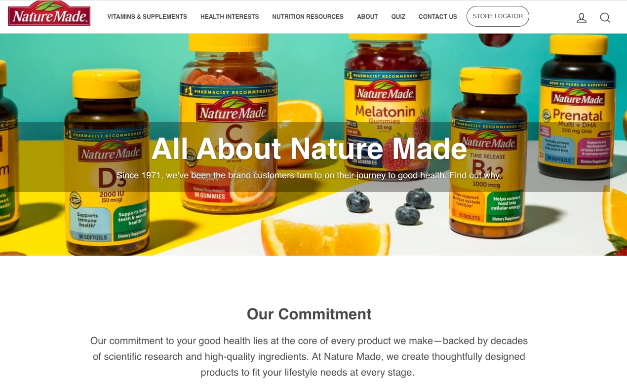
            Your About page is where you should tell the story of your company, including when it started, why it’s in business and what exactly it does. This page can also feature bios of some employees. Keep it simple and you’ll keep it powerful. NatureMade has a great example of an About page.  

            Category Page

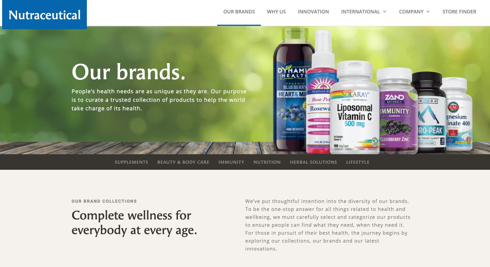
            This is the landing page for categories, such as, “Vitamins,” “Supplements,” “Nutraceuticals,” etc. Each of these pages then gives an overview of all products in a single category instead of listing every single product. Having a category page greatly simplifies site navigation for your audience. Head over to Nutraceutical to see what they have built.  

            Product Page

            This is a huge goal of your eCommerce site — to get people to check out the products. Each product page should include all product details, prices and a prominent “Add to cart” button. Tech-savvy companies also include reviews, similar products and social media sharing icons on their product pages.

            Cart Page

            On this page, your customer needs to see everything he or she has added to the cart while shopping. It’s vital to make any cart updates quick and simple. Allowing the user to update quantities from their cart leads to some of the highest interaction rates on an eCommerce site.

            In addition, it’s a good idea to prioritize the placement of your checkout button. When this button is “above the fold,” eCommerce stores see a 3.5% lift in conversion. 

            Finally, on this page, try to do some upselling. Show similar products and have an “Add to Cart” icon next to each one for quick and easy additions.

            Log in / Create account pages

            Once your audience is able to create an account on your site, you’re then able to capture tons of valuable information. This includes their name, email address, birthdate, preferences, order history and more. Once you have this information, you can begin to customize your messaging for each customer, increasing their loyalty to your brand.

            Contact page

            This is arguably the most important page on your site. If a potential customer wants to shop but needs to get in touch with you first, you have to make sure they’re able to do so quickly and easily so they can go on to make a purchase.

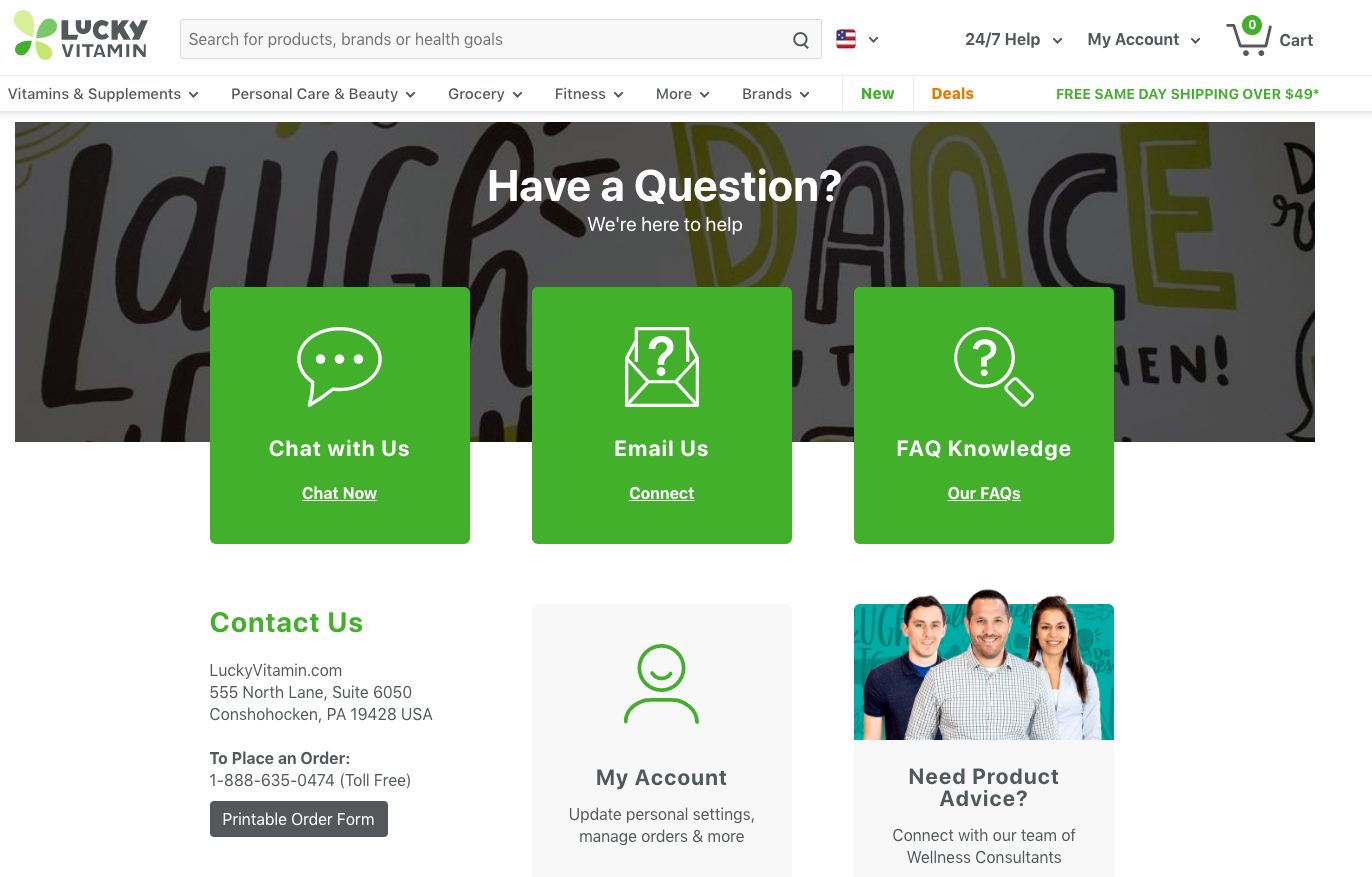
            The Contact page should include many ways for a customer to get a hold of your company, including your email address, phone number and live chat. When customers can easily access your company this way, they’re much more likely to have a great experience that they remember and share.

            Lucky Vitamin has a great Contact page.


            FAQ page

            Nowadays, most people don’t want to pick up the phone and call a company unless they absolutely have to. By having an FAQ page on your site, you can have all of the answers to your customers’ questions available 24/7.

            At InteractOne, we recently wrote a blog post about what’s best to include on an FAQ page. Although this particular article was written with fashion eCommerce websites in mind, it can also apply to pharmaceutical eCommerce websites.

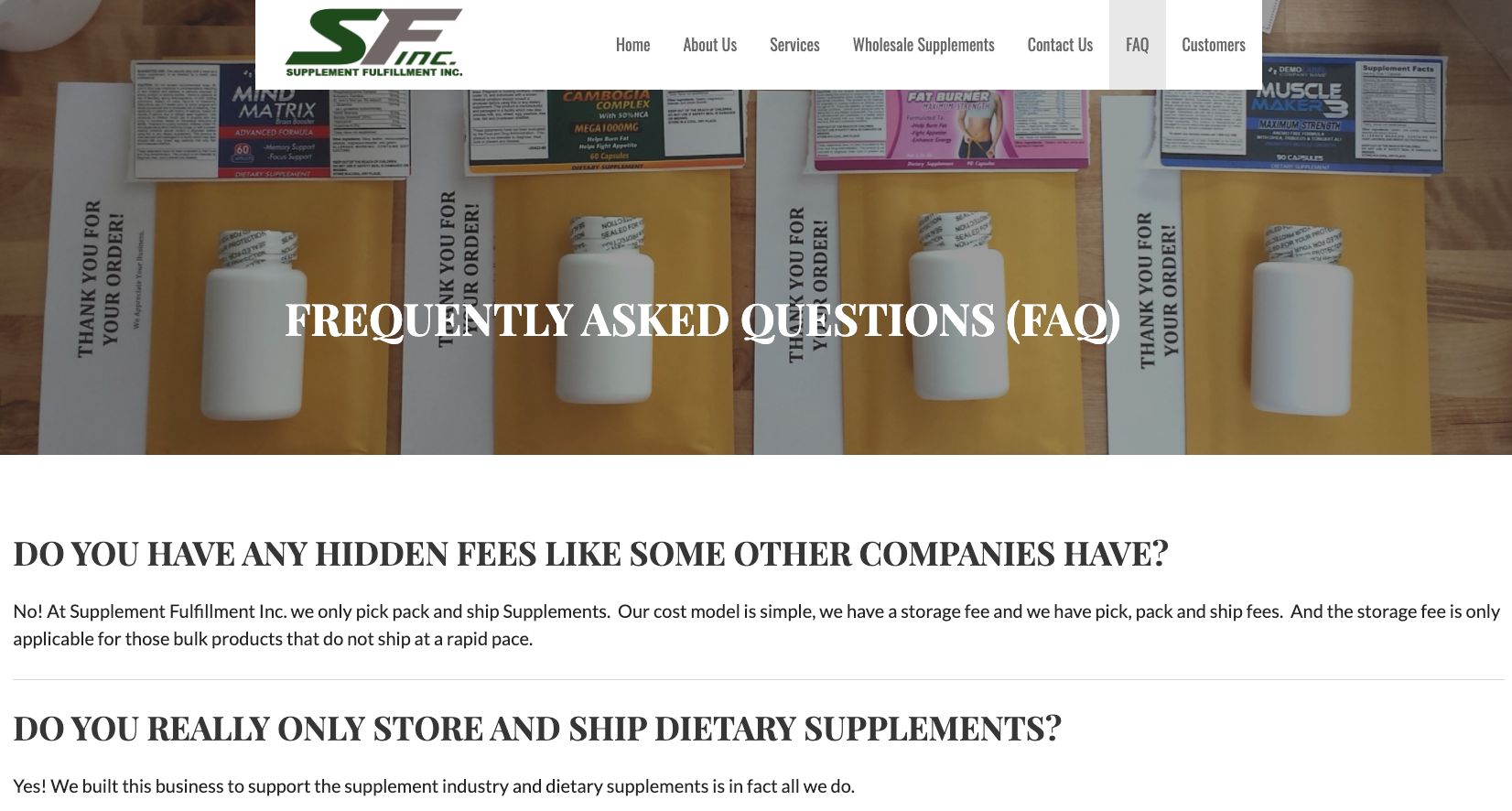
            Supplement Fullfillment has built a great FAQ page.


            Store Locator page

            If your business is online only, then you can forget about this page. But if your business has an actual brick and mortar store (or more than one store), then it’s important to have a Store Locator page on your site so that customers can also order and/or pick up your products at an actual storefront. 

            At InteractOne, we use the Magento 2 Store Locator extension for this, which is a module to manage store location. It helps customers find the nearest store location quickly and easily.

            Conclusion

            By following this page guide as you build your pharmaceutical eCommerce website, you’ll efficiently set up your company for success.

            For help building the most essential pages of your pharmaceutical eCommerce website, don’t hesitate to contact us today.

              Get expert help today!

              An InteractOne Senior Team Member will get back to you within a day.

              Drop Us a Line At:

              Our Contact Form

              Or, if you prefer an old-fashioned phone call:
              Phone (USA): (513) 469-3362

              4665 Cornell Rd. Suite 255
              Cincinnati, OH 45241

              UPDATED How Digital Fashion Brands Can Create a Sense of Urgency and Increase Sales

              UPDATED How Digital Fashion Brands Can Create a Sense of Urgency and Increase Sales

              Urgency can be a powerful tool when attempting to convert visitors to your fashion eCommerce store into customers. How many times have you talked yourself out of buying something? The longer a shopper spends mulling over a product, the more likely they are to abandon it. On the flipside, when there’s a sense of urgency, and a feeling that the deal is finite, the more likely the customer is to click “purchase.” 

              This doesn’t simply mean putting “buy now” banners on your fashion webstore or doing a social post promoting a sale. In this guide you’ll learn seven tactics for increasing your conversion rate by creating urgency in your customers.

              Cart abandonment emails

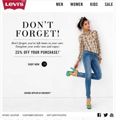
              Shoppers abandon their carts for many different reasons—often it’s unexpected shipping costs, a faulty discount code or a slow-loading page. While you should try to mitigate all of these things in an attempt to decrease your cart abandonment numbers, you should also always follow up with customers who do abandon their carts. Because more often than not, they are still interested in your product. A well-crafted cart abandonment email can be the difference between closing the sale and having that incomplete order remain. Convey urgency in a short and friendly email, with a subject line like “Get your favorite top before it’s gone!” or “<Name>, you forgot something!” Avoid anything that pushes too hard or is too vague, like “Limited time only” or “Last chance.” You can also instill some curiosity in your subject line and email copy—“I think you left something…” is a good example. Shorter is better, and a little personalization goes a long way to developing great relationships with your customers. Levi’s does an excellent job with their simple, clean reminder emails. 

              Limited-time sales and discount codes

              Why do you think your inbox is constantly flooded with limited-time sales and discount codes? Because they work! These time-sensitive initiatives are a no-brainer for creating a sense of urgency in your customers, and almost seem to create a ticking clock in their minds. If someone is interested in your product or service and sees an end date or expiration date for a discount code, it’s a trigger that compels them to make up their mind on whether or not to purchase. A deadline is a powerful incentive to action. Help your customers make up their minds by giving them a time limit.

              Timers or countdown clocks for deals or carts

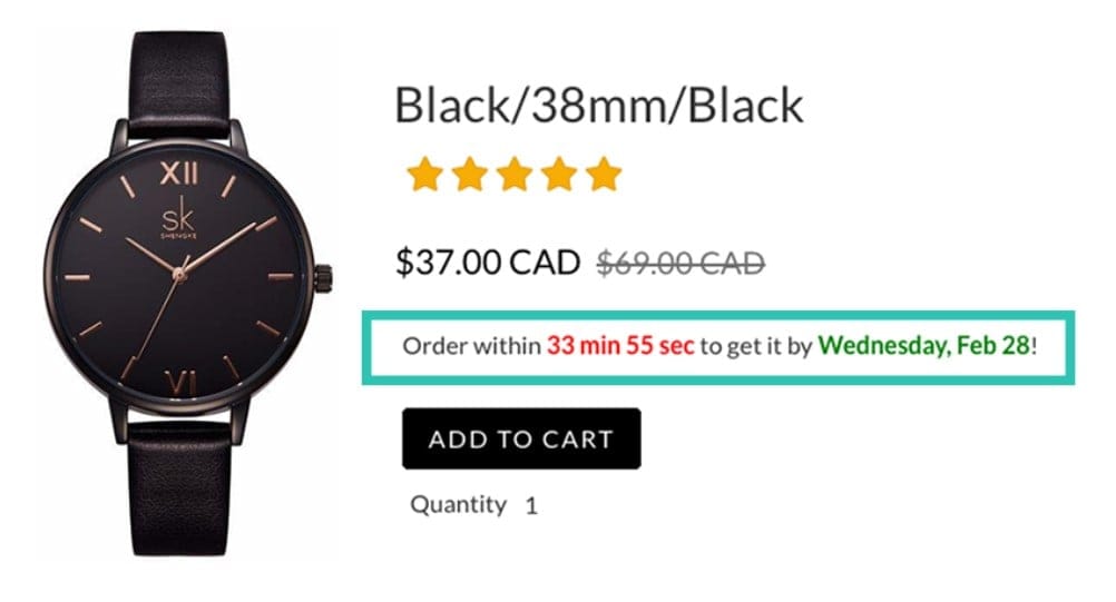
              While on the topic of time limits, let’s discuss countdown clocks. Provide a striking visual element that ties in nicely with your limited-time sales and discount codes by adding a timer to carts, or countdown clocks on your product pages. This reinforces your deadline, and provides a strong prompt for action. As time ticks by the sense of urgency to buy is only going to increase. Your timers or countdown clocks don’t have to indicate end of sale times, either. They could also be used to indicate cut-off times for next-day delivery, or a more personalized offer. Amazon has an excellent example of a countdown clock. 

              Tap into shoppers’ FOMO

              People assign more value to things that they perceive to be in short supply. Shoppers can be enticed into acting fast if they think there’s a chance they’ll miss out. Tap into this FOMO, or Fear Of Missing Out, by creating a sense of scarcity. High fashion naturally does this by producing smaller runs at higher price points, creating a limited range and therefore competitive market for their product. But brands with larger runs or less-limited ranges can still create urgency by releasing smaller batches at a time. A message on a product page conveying the limited nature of stock available can be enough to drive more conversions, as the sense of urgency to buy is increased. “I better buy it now, while my size is still in stock!” they’ll say. No one wants to be the one who missed out on a coveted item because they took too long to make their mind up. The same can apply to a service, as well, if you communicate that you can only take on a certain number of clients at a time.

              Ensure your offer is relevant

              Urgency will only work if the product or service in question is one that people want. If your customers are expressing demand for particular styles, sizes or products, be sure to highlight these on your homepage. Trying to repeatedly push old products that haven’t moved well will only make your brand look tired and defeated. Give your customers what they want and remind them why they were interested in you in the first place! The same applies to special offers—pay attention to what customers are saying in your reviews and social media. If there are requests for cheaper or easier shipping or bundle deals, consider offering that as a way of increasing urgency. Shipping costs being too high was shown to cause 63% of cart abandonment in a study by Statista. So give your customers what they want, because after all, urgency is about amplifying existing feelings of wanting something, not creating them out of nowhere.

              Make returns easy

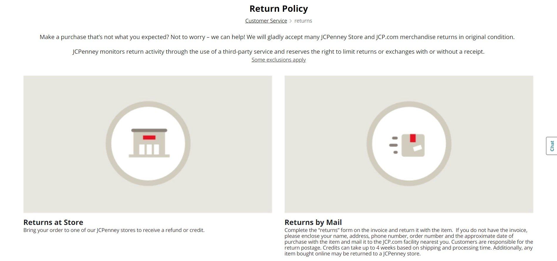
              One of the number-one concerns for online shoppers is that they’ll be stuck with something that doesn’t fit or isn’t exactly what they were expecting. While you can’t always make everyone happy all of the time, you can certainly try by being as upfront and honest about your products as possible, and by providing an easy way for items to be returned for a refund or for store credit. Whichever of those options you choose, it’s imperative for you to make this clear before your customer well in advance of the checkout page. Get your customer on your side and have them quickly clicking “purchase” by making returns easy. JC Penny has an excellent example of a clean and straightforward return policy page. 

              Use warm colors

              Green doesn’t always equal go. Sometimes you need to opt for a different color scheme, and those times are when you need to increase urgency. Red, yellow and orange have all been said to help in this instance. A study by Hubspot found that a red call-to-action button performed 21% better than a green button. Of course it pays to test this theory with your own website and audience, and not all audiences are created equal—perhaps Hubspot’s audience had a personal preference for red. It should also be mentioned that customized colors are key. Work with your brand’s existing color scheme, and if red doesn’t suit it, try something else similar.

              Conclusion

              Ultimately, urgency is a tactic to be used in moderation. Don’t employ every trick in the book all at once, or you’ll risk driving your customers away. Help them take you and your offers seriously by employing a measured approach. Through trial and error you will find the urgency tactic that works best for you and your customers. To learn more about how to improve your onsite promotions and messaging and other eCommerce marketing tactics, contact us today.

                Get expert help today!

                An InteractOne Senior Team Member will get back to you within a day.

                Drop Us a Line At:

                Our Contact Form

                Or, if you prefer an old-fashioned phone call:
                Phone (USA): (513) 469-3362

                4665 Cornell Rd. Suite 255
                Cincinnati, OH 45241

                UPDATED: Image Search Engine Optimization 101 for the Automotive Aftermarket

                UPDATED: Image Search Engine Optimization 101 for the Automotive Aftermarket

                What’s the first thing that shoppers look for when considering a new aftermarket upgrade for their cars? Pictures, usually. More specifically, pictures featured on platforms like Google Images, Instagram, and Pinterest. 

                Whether it’s aftermarket modifications or DIY maintenance components, modern automotive shoppers generally do their research online. As noted by the Specialty Equipment Market Association (SEMA) in a meta analysis, automotive aftermarket “shopping starts with an inspiration, which for this generation begins online.” Browsing images of cars similar to their own is what “stirs their emotions and encourages them to formulate dreams.” In other words, they want to see their car “trying on” the component before they make a purchase.

                There’s no doubting that unique, quality images are integral to your automotive web store. The challenge is getting your images in front of the eyes of potential customers when all of your competitors are trying to do the same thing.

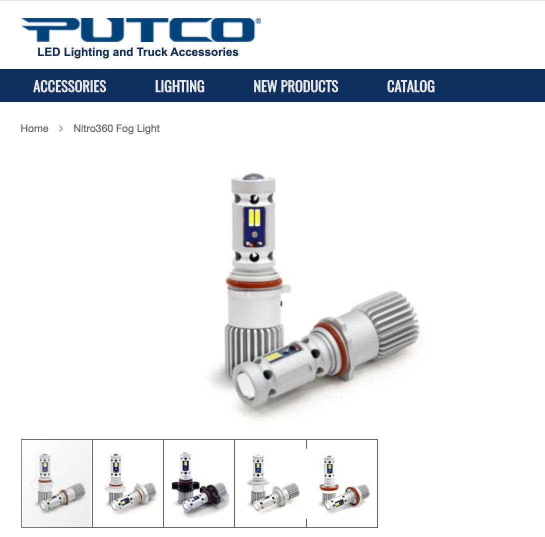
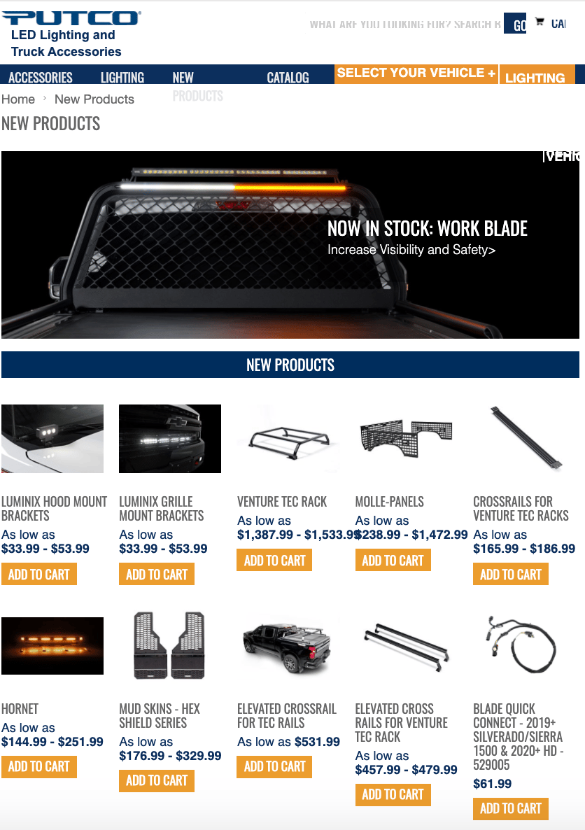
                In that regard, the journey to maximizing the visibility of your images across platforms – and using that visibility to boost traffic to your website – begins with some proper SEO and image optimization. For a great example of product images, check out Putco’s webstore

                Compress to Conserve Data

                Google doesn’t like it when you waste users’ bandwidth – especially mobile users, who are often restricted by monthly data caps from their ISPs. Taking a large image and simply shrinking it down via HTML tags only changes the appearance of the image. The same unnecessarily large file is still loaded on users’ devices, it’s simply displayed smaller on their screens.

                That creates a couple of problems. For one, Google’s algorithm notices those oversized image files wasting data and dings your site for not being optimized. Secondly, larger files equal longer load times, which Google also penalizes. Having your website populated with unnecessarily large image files can even make it hang up or freeze on some users’ devices, hitting you with the third and final blow of an increased bounce rate.

                Create Relevant File Names

                It’s only a small bump in SEO friendliness, but every bump counts. Edit the image file names on your server to something unique and relevant. For example, you might name an image of a chrome wheel something like “20_inch_mag_wheel_chrome.jpg” instead of the random string of characters that it’s named by default.

                Those relevant keywords in the file name give search engines another opportunity to properly categorize and rank your images. Furthermore, it makes them more user-friendly: users who open your images in new browser tabs or download them will be met with a nice, descriptive file name.

                Write Unique and Descriptive ALT Tags

                ALT tags give you yet another opportunity to sprinkle your images with some SEO- and user-friendliness. Essentially, the whole purpose of an ALT tag is to describe the content of an image for algorithms as well as visually-impaired users. Make sure all of your images have brief, relevant ALT tags peppered with some of the keywords your page is targeting.

                Combining the descriptive file name and ALT tag, you’re left with a nice SEO-friendly image tag that looks like this:

                Surround the Images with Relevant Text

                Of course, in the end it all comes down to content. No amount of optimization will propel your site and web images to the top of search results if the written content isn’t unique, relevant, and well-executed.

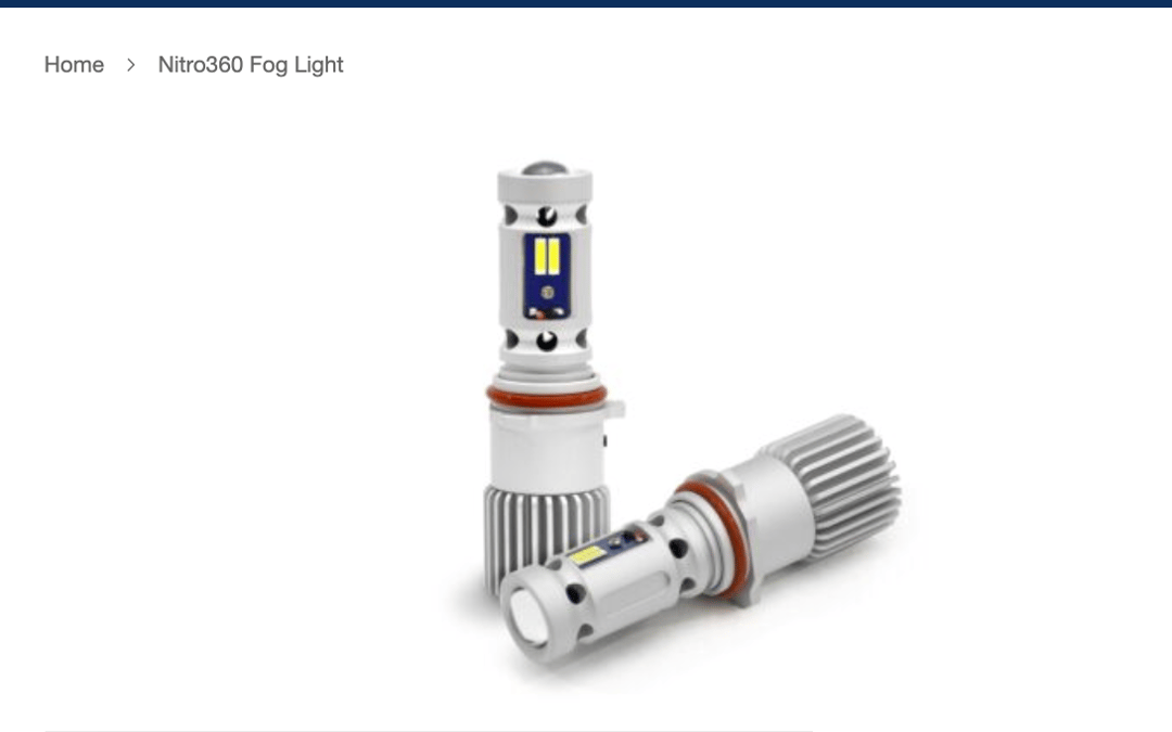
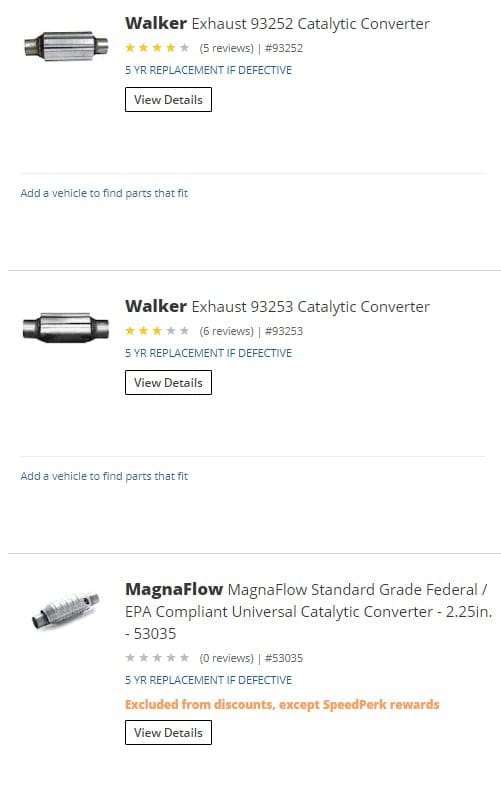
                When it comes to images, the page text will further help search algorithms categorize and rank you by subject and quality. For example, an image of a chrome wheel could appear on an automotive aftermarket web store, a bicycle shop, a page offering Google Chrome icon packs, etc. It’s the text on the page in the vicinity of the image – most notably the caption – that tells algorithms what they’re looking at. Below, you’ll see a great example of this:

                Conclusion

                Once you get all of your web images compressed, optimized, and placed correctly for SEO purposes, you’ll have a solid foundation from which to build platform-specific image marketing strategies. Create unique, high-quality images, tag and market them effectively on Google and social media, then you’ll really have a leg up on your competitors’ stores when shoppers go browsing on their favorite image platforms for some automotive inspiration. Reach out to us today and let’s discuss how to make this magic happen on your own automotive eCommerce site. Check out our DualLiner case study too. 

                  Get expert help today!

                  An InteractOne Senior Team Member will get back to you within a day.

                  Drop Us a Line At:

                  Our Contact Form

                  Or, if you prefer an old-fashioned phone call:
                  Phone (USA): (513) 469-3362

                  4665 Cornell Rd. Suite 255
                  Cincinnati, OH 45241